Well Hung: Poetry, Ebooks, and Indents, Part Two
This is a guest post from Chris Wait (@cdwait), who is Ebooks Manager at New Directions Publishing, where he digitizes all the books. This is the second of a two-part series on digital poetry and converting to MOBI
Theory: The Style Wars
In 2016, ebookcraft hosted a debate between @indiamos and @nickbaretto titled “Does Design Matter?” It was a skirmish in a long-running civil war pitting designers, who want control of the final appearance of their product, against reading systems (and sometimes readers). Baretto mounted a passionate defence of design, but it was hard to argue with Amos, who, besides being generally not impressed, argued that print-focused flourishes like sinks, embedded fonts, and fancy headers are useless clutter in the digital space. You may have a masters in graphic design from Parsons, but if the reader wants Moby Dick in pink comic sans against a teal background, who are you to judge? If you want a print replica, export a PDF. Otherwise, embrace the reflow and let the user-reader have the final say on questions like line height, margins, typeface, font-size, color scheme, even text alignment.
If you want a print replica, export a PDF. Otherwise, embrace the reflow and let the user-reader have the final say on questions like line height, margins, typeface, font-size, color scheme, even text alignment.
If you’re in Amos’s camp, books are a package and the words are the content. There’s no essential difference between a novel printed on perforated paper and the Easton Press edition; all your painstaking design-y stuff is no more than a silk ribbon or a gilded edge, pretty, yes, but utterly useless. The reading experience springs from the content, not the styling. This approach is analogous to that of Web design, ruled by the dogma of separating form from content. Structure is structure and style is style and never the twain shall meet.
Poets, however, have this weird tendency to flout dogma and strain against limitations
Poets, however, have this weird tendency to flout dogma and strain against limitations. They also pay as much attention to white space as they do to word choice. The way we see poetry on its canvas is integral to the way we experience it. Check out some concrete poetry if you don’t believe me. The question “does style matter” is no longer about font pairings and rococo h-rules; it’s about semantics, it’s about the meaning of the poem itself.
The question “does style matter” is no longer about font pairings and rococo h-rules; it’s about semantics, it’s about the meaning of the poem itself.
Practice: Ems vs Percents
Case in point: William Carlos Williams, one of the most influential poets of the 20th century, innovated what he called the “variable foot” as a way of reconciling the conflict between free verse and formal poetry. There is disagreement about what Williams was trying to accomplish with the form, but it’s obvious that the presentation is critical to its effect: three lines with stepped indentations, each below the last.
What happens when we put a piece of one of these poems on screen?
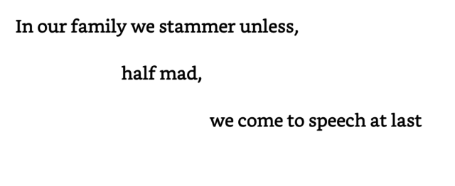
In this version, the indentations are styled in ems. Typeface aside, this is more or less an exact replica of the print. Let’s increase the font size.
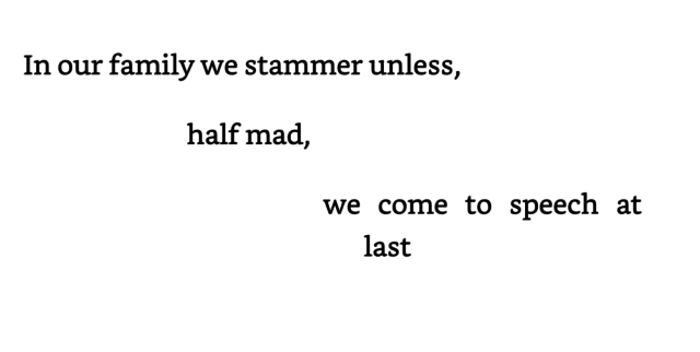
Our hanging indent kicks in, keeping the last line of the triad together. Because ems are used, the indents stay proportional when the font-size is increased, which means the “we” is always going to be aligned with the comma following “mad”. Perfect, right? Let’s bring it up from Kindle size seven to size eight.
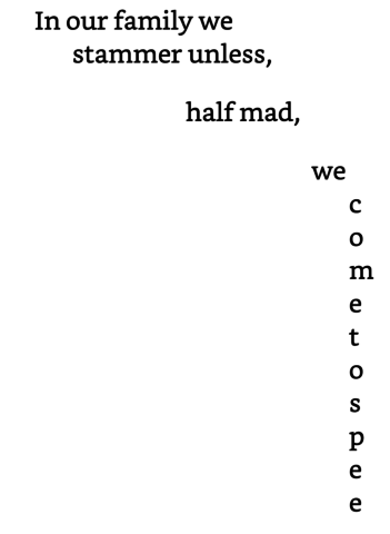
Ugh. There are situations when vertical runs of text are called for (see the Selected Writings of Guillame Apollinaire). Suffice it to say, this is not one of them.
Rock, hard place. How can we honor the poet’s intentions and, at the same time, design a more responsive, flexible ebook—and one that will work on most current reading systems? There’s no right answer to this question, and different ebook developers will come to different solutions. The one I came to is to use percents to set the indentations. So instead of this CSS:
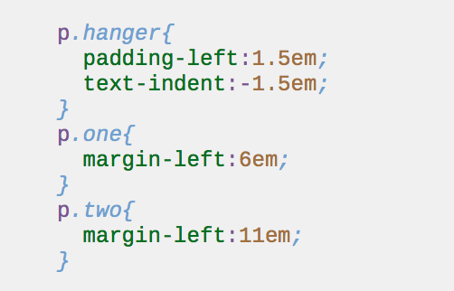
You would have:
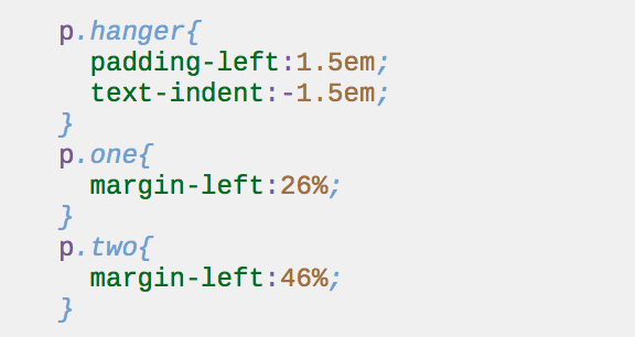
The upshot: as the font-size increases, the depth of the indent shrinks. This means that the presentation will be readable at a wider variety of user settings, and, in this specific example, the variable foot will be maintained by the hanging indents when the line does come up against the right margin.
Here it is at Kindle size 5 (which I use as a default when designing):
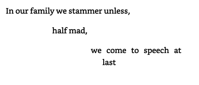
The indentation is very close to the original. Let’s jack up the font. Computer, enhance:
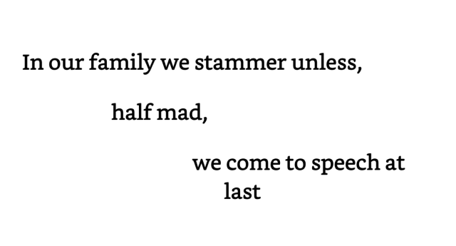
Enhance!
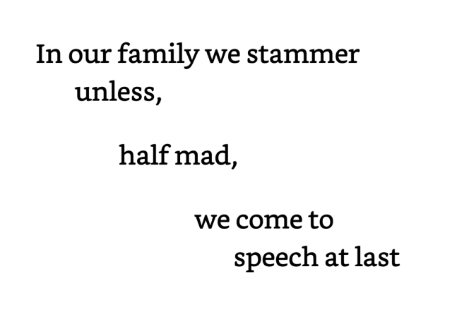
This isn’t perfect, but it’s a hell of a lot better than a one-letter column drooling down the right edge of the viewport.
This isn’t perfect, but it’s a hell of a lot better than a one-letter column drooling down the right edge of the viewport.
The bane of this approach is, of course, landscape mode, where, at low font sizes, the indents are greatly exaggerated:

And we’re right back to our least shitty compromise. Wrapping the <p> tags in a <div> and giving it a max-width could work, but for the moment, Kindle does not support this CSS (though for progressive enhancement, this would be a great place for a feature query). Media queries are another potential solution, but this will double already extensive CSS work (for free-verse poetry that has a wide variety of indent depths, you’re going to need a stylesheet with 30-40 classes, one for each unique indent) and the support is all over the place. Last time I checked, out of all Kindle devices, only Fire supported landscape queries; after exhaustive testing, I came to the conclusion attempting device-width queries for Kindles is sheer madness.
In the end, a reading system that makes a page that wide is probably a bad reading system; I tried to test the max-width solution in Readium, but it appeared to have something similar already built in.
In broad strokes, that’s my approach to indenting poetry. It has its advantages and drawbacks, and there are as many exceptions to any rule as there are poets who have experimented with the placement of the word on the printed page. The important thing is not to marry yourself to any one approach, and to let each problem suggest its own solutions—as Roethke suggested, to learn by doing.
”To Daphne and Virginia” By William Carlos Williams, from THE COLLECTED POEMS: VOLUME II, 1939-1962, copyright ©1953 by William Carlos Williams. Use by permission of New Directions Publishing Corp.
Not trying to be contrary or contradictory, but I wonder: When something is created for one technology (a uniquely indented poem created for the inflexible, immutable printed page), what’s the value of presenting it on another platform that doesn’t honor or reflect that original intent?
I agree that the content should be available to all, but when it can’t reproduce exactly the poet’s intent, who is served?
I’ve written CSS with billions of lines to create billions of levels of indents for hundreds of poems; I respect the intention (and I always use % for left and right margins). And I won’t stop trying, partly because I find it fun. Once created, you can re-use the CSS, so the process stops being so trying (except when you’re lining up the first letter of a word directly beneath a comma, which is also kinda fun).
And I recognize, admire, and applaud efforts to make these poems e-readable, as what is learned here helps us everywhere.
But, do we relax our honoring of the poet’s intent to get the words out there? I’d be interested to hear about the in-house decision-making that goes into deciding which books to adapt into ebooks. (To me, it is an adaptation, as the exact intent is more-or-less replicated depending on how the book is e-read.)
Of course, we could just make a fixed layout ebook of it and be done (tee-hee).
Hi Kevin,
Thanks for commenting!
Well, I think the page is not so immutable as we ebook people make it out to be. Popular poetry books get published in dozens of editions; they get published in magazines, in columns and newspapers, in different typefaces with different margins, even different colors of paper, they go out on broadsides and are scrawled onto walls, and on and on. The poet, for much of the 20th century, would have written the poem out by hand, then typed it up on a typewriter, which would be submitted to the publisher, who typesets it; which exact spacing, say, of an indent, reflects the real authorial intent—the first draft, the copy, or the finished book?
So yes, it’s an adaptation, but it’s still text in/on a white box. There are going to be (usually minor) differences of spacing, etc., but I as long as the relation of words to whitespace is more or less the same, I can sleep easily knowing that I’ve done justice to poem and the poet. At least that’s how I let myself off the hook.
At my publishing house, we convert everything that’s feasible. Unless it’s Dylan Thomas or Stevie Smith, your best-case scenario with poetry is breaking even. The only books we don’t publish are ones where the formatting really is print specific—when the intent really can’t be transferred (see Robert Lax’s Hermit’s Guide to Home Economics for a good example).