We All Float Down Here

This is a guest post from Chris Wait (@cdwait), who is Ebooks Manager at New Directions Publishing, where he digitizes all the books.
I Had This Nightmare One Time That I Worked in E-production
About a week ago, I got up earlier than usual, had my coffee, checked the news on my morning commute. I was in a good mood. The weather had recently turned for the better, and I was finishing up a tricky ebook project with a lot of author investment. When I got to the office, I started up my testing suite: Kindle Previewer 2, Adobe Digital Editions, iBooks, then on-device with Kindle Fire, Paperwhite, iPad and Android. Everything worked, everything looked good. I made some final tweaks, posted the file, patted myself on the back, and moved on.
After work, I took my dog, Lula, for a walk in the park. People were smiling. I sat down on the slope and unhooked the leash. A child, maybe five or six, walked up and asked if she could pet Lula. She was wearing an Adventure Time T-shirt featuring Gunter, the Ice King’s penguin friend . . . Penguins . . . Suddenly, I remembered a brief exchange I’d had on Twitter with @word_hunt about Kindle Previewer 3. The new testing tool had been out for over a year, and I still hadn’t started using it in a systematic way.
“I should probably . . .” I thought. But no. Sunlight filtered through leaves that had just filled out for the summer, a warm breeze blew across the park, and everything was right with the world, including my ebook. I went home, ate dinner, read a bit, and went to sleep.
This wasn’t readable, this was madness!
Hours later, I woke up in a cold sweat: I’d had a nightmare. The text in one side of the page grew huge before my eyes and lumbered over to feed on the notes along the right-hand margin. The words on the right panicked and fled, crowded against the viewport edge, and were decapitated by the relentless descenders. The indentations giddily ignored my style sheet, jumping halfway across the page or recessing deep into the unknown dimension beyond the left margin, pulling the dizzy eye with it, until I, the reader, swooned and gripped the desk: this wasn’t readable, this was madness!
I ran to my computer and opened Kindle Previewer 3. After what seemed like an eternity (KP3 takes a really, really long time to load—sometimes over a minute, even for relatively small files) the title page (a jpeg, that’s right Jay, a jpeg) came into view. I clicked through the first few pages. Everything was fine. Until I hit the first float.
Everything was not all right with the world, and my ebook was a mess.
Drowning by Flotation Device
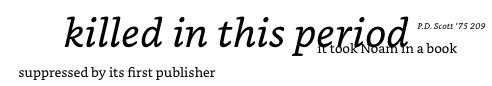
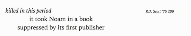
I was working on a book-length poem, Coming to Jakarta by Peter Dale Scott. The poem is structured in three-line stanzas, with a jagged but regular indentation scheme. Throughout the poem, references are made to a variety of secondary texts, ranging from news articles to Amnesty International reports, histories, declassified documents, poems ancient and modern, and sacred scriptures. These sources are documented in right-aligned side notes that run along with the poem and sit on the same line that contains their reference. The same format is used to provide translations.
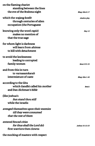
As formatted, the poem and the notes form their own kind of dialogue between primary and secondary text that stitches its way through the book: as often happens in poetry, there is no clear line between questions of layout and questions of meaning, between style and content.
To preserve the formatting, I had to resort to a well-worn kludge: the float. Originally intended to allow text to wrap around photos and graphics in layouts as HTML moved away from tables, the float became a common way to design column layouts in CSS. And in ebookland, when it comes to non-standard layouts, it’s the best-supported way to avoid tables, which you should avoid, for reasons. Or it was.
In this book, a representative stanza has the following HTML:
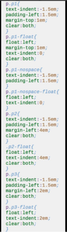
With the following CSS:
*If the negative text-indent looks weird to you, check out my last post.
To horizontally align the side notes and lines of poetry, I floated both the right- and left-aligned text, then cleared the following line. I made the side-note font size smaller than that of the main text to capitalize on screen real estate when it’s scarce. The result, in KF8, iBooks, and ADE, and device tested via sideloading is this:
And, once more, in KP3:
KP3, and the format it outputs (KFX), was obviously doing some heinous mangling to my file. But what, and why? The answer comes in two seemingly innocuous—and even hopeful—words: Enhanced Typesetting.
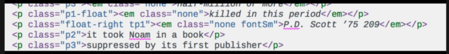
![]()
*A side note of my own here about how great the #eprdctn community is: within hours of posting my problem, I had multiple people offering help, including CSS wizard and Kindle Assassin @jiminypan. All of the insights into how KP3 actually works are his. So you should really follow him, because he knows everything.*
But how will Kindle’s converter know what a drop cap is? Some kind of semantic markup that Amazon could announce to ebook developers? Nah, that’d be cheating! They came up with a better way: treat every floated element except for <td> and <tr> that has a larger font size than the immediately following element as a drop cap. And that’s how we got to figure 1. Why did they go to the trouble of excusing table elements from their drop-cap machine, but not, say, <p>, which no developer in her right mind would use for the first letter of a paragraph? Don’t ask me.
Never do anything clever in Kindle books.—Keith Snyder
There are two ways to make this issue go away, as @jiminypan and I discovered in testing. The first and easiest is to make sure your float’s font size isn’t larger than the following element. You make have to sacrifice design, but the file you push out will probably look OK when it gets to the reader’s device. The second is to “fix” KP3, which you can do by opening the coreprocessor.js in the Previewer package and adding <p> to a list of excluded tags:
 This solution, however, doesn’t work for publishers that will be providing a single file to all their distributors; I’m not even sure it would work if you provided the already “fixed” file for sale on Amazon. That, and KP3 has also garbled all of the floated elements that were styled with indents; I still have work to do.
But I’m not going to waste any more of your time ranting about Amazon. The takeaway here is, as @noteon put it, “Never do anything clever in Kindle books.” The problem is that in poetry, you often don’t have a choice: your options are to hack it or to not do it at all.
Just don’t hack yourself—or anyone else—to pieces in the process.
All screenshots from COMING TO JAKARTA, copyright ©1988 by Peter Dale Scott. Use by permission of New Directions Publishing Corp.