Hanging Indents and other poetry puzzles

How exciting that the digital publishing world has evolved to the point where we are at last having conversations about design and poetry and accessible layouts. This isn’t the first conversation of this sort, of course, but it is most definitely a sign of maturity in the ebook world.
And it points to the inevitable question: how do you design for a format that will be read twenty different ways by twenty different readers? Well, you could follow each ebook home offering advice on font choices and page width. But that might be a little creepy. The affordance of ebooks is that they are malleable to the readers needs. Change the font size, the background colour, the typeface, the leading and justification. It’s a designer’s nightmare, really.
The affordance of ebooks is that they are malleable to the readers needs. Change the font size, the background colour, the typeface, the leading and justification. It’s a designer’s nightmare, really.
So understanding that we can’t control a lot of things about the end user’s reading experience, let’s talk about how to set that reading experience up for maximum success. Step 1: Avoid the fixed-layout format, choosing reflowable EPUB wherever possible. I see publishers opting for the fixed layout format because they feel that the page will get too messed up in reflowable. It’s too complex, the artistic vision will be lost, the text design will suffer. I would suggest that trying to control a reader’s experience like that will come to no good in the end. And opting for fixed-layout effectively excludes print disabled readers from consuming that book.
Particularly in the case of poetry, choosing to publish in PDF or fixed layout shuts down access to that book for a wide swatch of the reading public. Poetry should be easy to access, formatted in a device agnostic manner, and openly available to whomever would like to purchase or borrow the ebook. Please be mindful of the impact of your format choices.
Poetry should be easy to access, formatted in a device agnostic manner, and openly available to whomever would like to purchase or borrow the ebook.
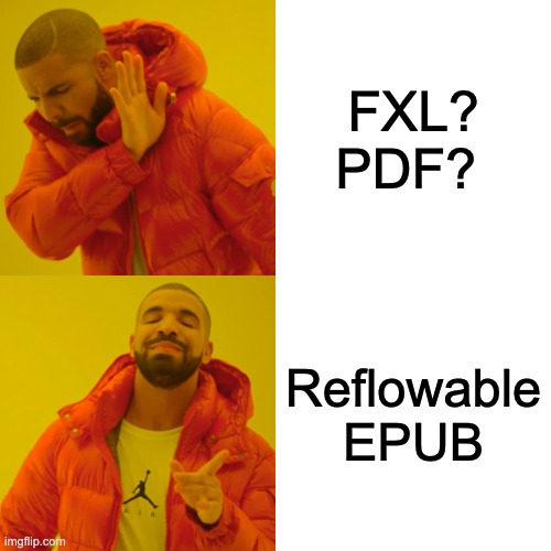
Let the HTML + CSS do the heavy lifting for you. Format your headers as headers, your text as text. When you need to achieve special spacing, build that with HTML and CSS. Anyone who has worked in a production or editorial department has seen some version of the Word file nightmare in this image. Spacing achieved with tabs, empty returns, and multiple word spaces instead of using style sheets and, well, actual formatting. The way that some poetry books are made are the HTML version of this muck.
To that end, use headers for headers, section tags around a poem and be mindful of your <p> tags. Use semantic HTML. That may seem like an elementary message but I see an awful lot of <p class=”h1”> in the wild. Avoid line break <br/> tags for turnovers where you can because you have no control over the width of screens. Use responsive CSS definitions.
- Use semantic HTML
- Make sure turnovers are turnovers
- Figure out which line endings are malleable and which must remain
- Clean out
<br />tags that aren’t absolutely necessary - Use responsive CSS definitions
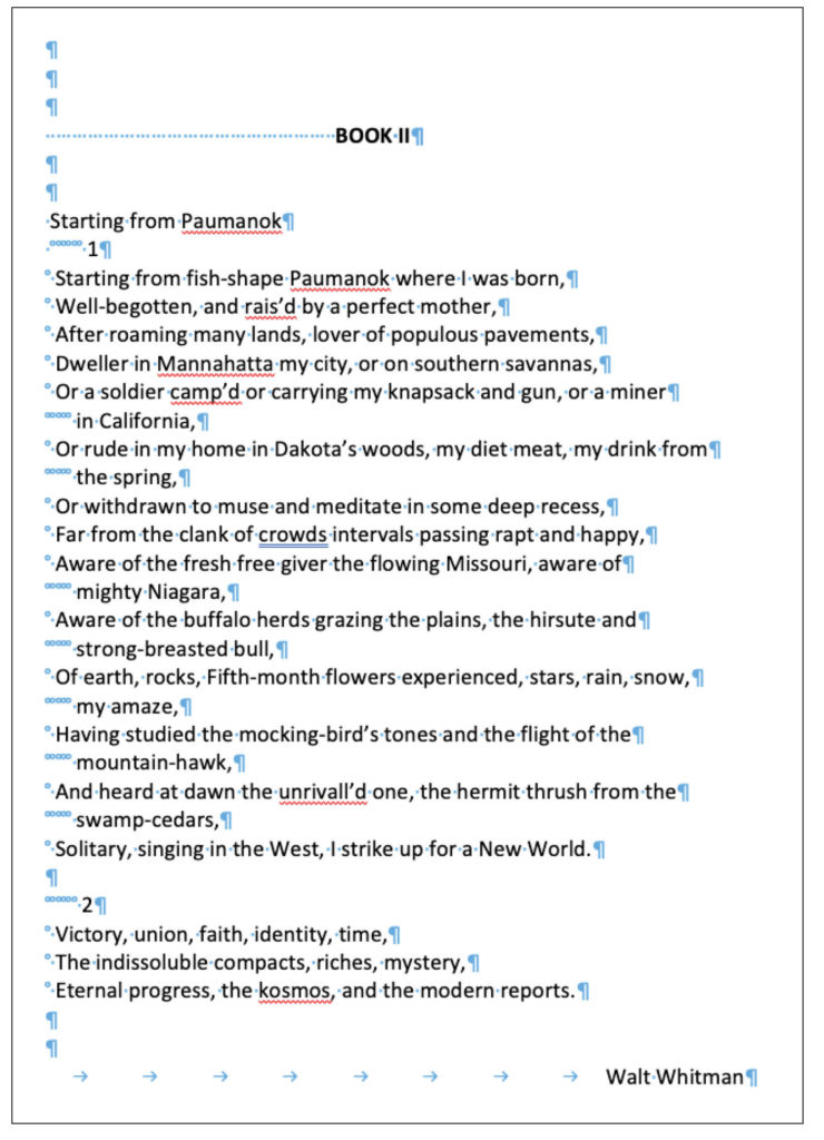
So what does that mean exactly? This is a picture of a page in Adobe Digital Editions of one not-very-complex poem, side-by-side with an image of the print page.
It is designed to look just like the typeset page. One of the things I had to figure out when I converted this book was whether those are turnovers on the second line or an indented line. This points to one of the gnarliest parts of digital poetry. It is important in converting poetry to consult a managing editor about how deliberate the line endings are and which can be sacrificed to a responsive page. In this case they look like turnovers but the narrow line length means that I maintained them as an indented standalone line. So each line is in it’s own paragraph tag with CSS acting to make it spaced as necessary.
You might notice that the spacing is off on line 7. I tried to approximate the indent with non-breaking spaces, something that is a relatively common approach in poetry markup.
<h2 id="_idParaDest-17" class="poem">
<span epub:type="pagebreak" role="doc-pagebreak" id="page31" title="31" />
Brightening Event</h2>
<p class="noindent">A black hole near the Milky Way is waking up.</p>
<p class="ind_spafter">Scientists have no idea what this means</p>
<p class="noindent">spark(ling) lightshows captured by telescopes</p>
<p class="ind_spafter">say nothingness has</p>
<p class="spafter">swallowed</p>
<p class="noindent">the known. At the event horizon falling materials<br/>
           are dragged in—stars, gas clouds, the dining</p>
<p> </p>
<p class="spafter1">room set that belonged to my grandmother, a shining<br/>gold sweater I left in a drawer of a house I no</p>
…
<p class="noindent">with no beginning or end.</p>
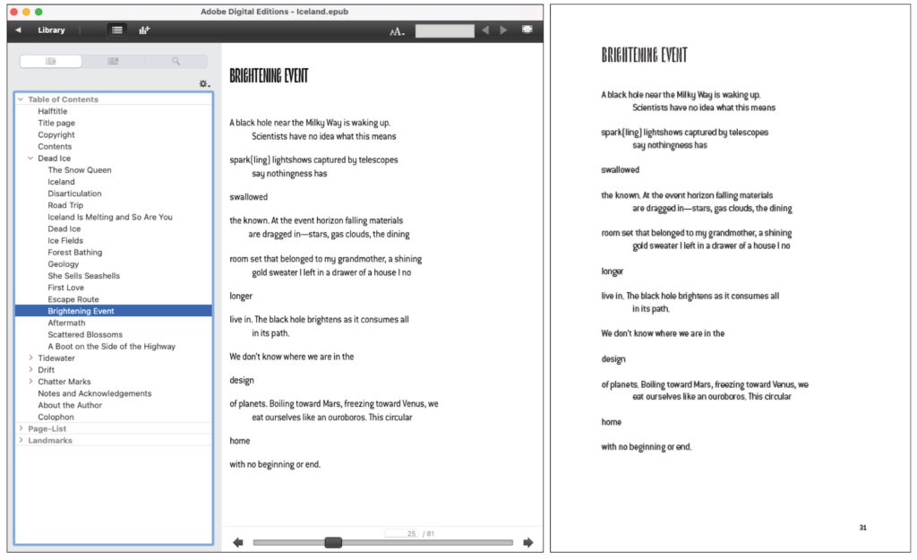
But let’s listen to this poem with Voiceover. I’ve recorded a short video of what this poem sounds like in Thorium, the stand-alone desktop ereading app from EDR Labs in France. If you weren’t aware of it before now, I urge you to look into it as a testing tool.
Things to listen for: appropriate pauses at the ends of lines and between stanzas. But watch the stanza starting “the known” and “room set”. The first is coded with non-breaking spaces to approximate the indent; those spaces get underlined as if they are a word. And the stanza that begins “room set…” is coded with a <br /> tag and no word space so the voiceover almost reads the end of line one and the beginning of the second as one word: “shinginggold”.
In case it slipped by you quickly, this is a screenshot of those non-breaking spaces being underlined as if they are a word.
The main message here is to test. A lot. Understanding that a synthetic voice is never going to be as warm and performative as a live poetry reading, testing with voiceover is still mighty valuable. Markup shortcuts maybe go haywire on assistive technologies in a way that you wouldn’t expect. Thorium is one way to do this, but there is a whole range of ways to QA for functionality and accessibility.
Whose job is it to make sure that the poetry conversions are true to themselves? As with most things in the digital publishing world, this is firmly in the realm of editorial-production collaboration. After many years of working in this space, I am convinced that the key to making a more accessible digital publishing landscape is to get editorial staff invested in accessible outcomes. I would never go so far as to suggest that the poets reign themselves in — although poets! Please be aware of the needs of both print and digital, I beg you. But editorial guidance when the ebook is converted is, in my humble opinion, key to moving the needle on accessibility and clean digital output.
Editorial guidance when the ebook is converted is key to moving the needle on accessibility and clean digital output.
I would be remiss if I didn’t point to this slightly unconventional approach to digital poetry. One publisher puts this note to the reader at the beginning of their poetry ebooks.
![[We] encourages you to calibrate your settings by using the line of characters below, which optimizes the line length and character size:
Lorem ipsum dolor sit amet, consectetur adipiscing elit. Pellentesque eu
Please take time to adjust the size of the text on your viewer so that the line of characters above appears on one line, if possible.
When this text appears on one line on your device, the resulting settings will most accurately reproduce the layout of the text on the page and the line length intended by the author. Viewing the title at a higher than optimal text size or on a device too small to accommodate the lines in the text will cause the reading experience to be altered considerably; single lines of some poems will be displayed as multiple lines of text. It his occurs, the turn of the line will be marked with a shallow indent.](https://epubsecrets.com/wp-content/uploads/2022/04/Note-2-1024x661.jpg)
I really appreciate how this note points out the complexity of balancing the needs of the content and the author and the format. It’s hard!
Balancing the needs of the content and the format is a challenge. But a combination of clean mark-up practices and rigorous testing will support this work, allowing poetry to flourish as ebook content.
This is awesome! Poetry is so dang tricky when it comes to accessibility.
I get where you are coming from, when you talk about the potential issues caused by using , but my question is: what about when it is important to indicate when someone moves from stanza to stanza? Screen readers can navigate by word, by line, by paragraph – but if each line of a poem is in a set of tags, they will never be able to determine where a stanza begins or ends.
Would this be the situation where you “need” to use ?