Well Hung: Poetry, Ebooks, and Indents, Part One
This is the first of two guest posts from Chris Wait on converting poetry to EPUB and MOBI. Chris (@cdwait) is Ebooks Manager at New Directions Publishing, where he digitizes all the books.
Run Away and Don’t Look Back
If you’re thinking about converting a book of poems into an ebook, my first advice would be: Stop. Are you sure you want to do this?
If you’re a poetry publisher looking to expand the audience for your books, forget it. People don’t buy poetry, and the people that do don’t buy poetry ebooks. They’re the most radical of the print-fetishizing Luddites: They pass around letterpress chapbooks and inhale deeply as they flip the pages inches from their noses, they loathe Jeff Bezos and if they touch a Kindle they break out in hives.
But, you might object, once it’s digitized and uploaded into The Cloud, it will live forever, producing a permanent if minuscule trickle of royalties for your descendants. We’ll see. Formats change quickly these days. Will the ebook go the way of the Dreamcast? Probably not. But one thing’s for sure: If it doesn’t get soaked or burned, your grandkids’ grandkids will be able to leaf through a paperback edition of The Art of the Deal as they sift through the wreckage of our civilization, trying to figure out what happened. The Kindles and iPads? Roof shingles and spades.
Until poets write for the digital space, poetry conversions will always be a game of making the least shitty compromise.
If you’re an optimistic poet who thinks ebooks are the bleeding edge of digital technology, think again. They’re not. Put your work on the Web. Or an app. Or a 360 degree simulation designed for the Oculus Rift, I don’t know. Skip ebooks. Ebooks are an atavistic technology, a quixotic attempt to carry some small part of the bookness of books—their length, their scope, their status as an object—over into a digital space where length is arbitrary, scope is unlimited, and the dimensions of our beloved word-containing rectangles are constantly shifting. These rectangles are the poet’s canvas, and often have a determinative effect on where she puts her words. Here we have the root of the problem in accurate poetry conversions: The vast bulk of existent poetry was, and continues to be, written for publication on paper, in books—collections, pamphlets, whatever. Until poets write for the digital space, poetry conversions will always be a game of making the least shitty compromise.
Maybe, though, you’re being paid to do this, and don’t really have a choice. Maybe you have a book that does actually sell. Maybe you’re like me, and are extremely lucky to work with a publisher that a) cares about poetry enough to digitize slow-selling legacy titles and b) gives its ebooks editor more than enough rope to hang himself. Whatever the case, if you’re dead-set on getting that poetry on screen, read on.
So you read, you consider, you do the best you can: Make your choice and don’t lose too much sleep over it. Your hanging indent shouldn’t be a Sword of Damocles.
The “Secret”
There’s a ton of poetry that converts fairly easily to reflowable EPUB. For lyrics long and short that are simply lined up on the left-hand margin, there’s only one trick you need to know: the hanging indent. This isn’t exactly a secret, but, as you’ll see, it’s not always as simple as it seems.
The hanging indent is a technique used by typesetters to, among other things, maintain the integrity of a line that is longer than the width of the page (less the margins). Here’s a poorly scanned example from Stevie Smith’s “The Hostage”:
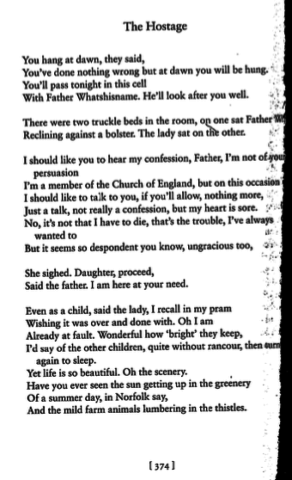
Lines seven and eleven employ hanging indents; the indents let the reader know that “persuasion” and “wanted to” aren’t meant to be read as one and two-word lines. The rhyme scheme here makes these easy to identify.
An ebooker doesn’t know the width of the device she’s styling for, and it’s highly likely that any line of more than a few words will exceed the viewing area on a small device like a cell phone, especially at large font sizes. Luckily, you can compensate for this.
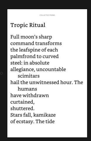
Denise Levertov’s “Tropic Ritual”, on the page:
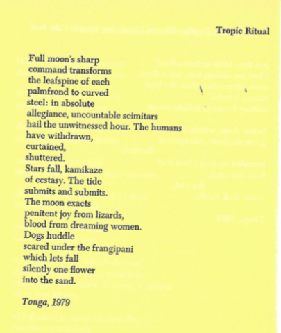
On device, at low font settings, it will look more or less like a replica of the print:
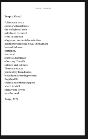
And at higher settings, the hanging indent kicks in:
Here’s the code:
Using padding to compensate for the negative indent leaves you free to style the margin without having to do basic math, which is always a plus for me. And there you have it, the hanging indent.
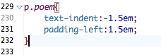
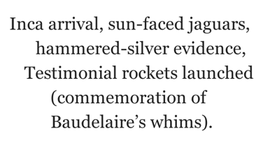
But what’s a hanging indent, and what’s a conscious line break? In Bob Kaufman’s “Spliced Reflections,” it’s not so easy to tell:
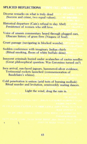
Does the text “Baudelaire’s whims)” constitute a fourteenth line, or is it a continuation of line thirteen? To find out, you do the unthinkable and actually read the poem, but the evidence there is inconclusive. The indent on line fourteen is a fraction of an inch narrower than those on lines two, four, six, nine, etc; was the typesetter telling us something? Furthermore, there are no other three-line stanzas—so then this is a couplet, like the others, that happened to spill over, right? On the other hand, there is that pesky one-line stanza; why couldn’t there be a three-line stanza? How can we differentiate between the poet’s hand and the typesetter’s? In HTML, you have to choose: Baudelaire can’t be in two paragraph tags at once. If you put him in line thirteen, the poem will look like this on wider screens:
And break at larger sizes:
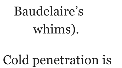
If you give Baudelaire his own line, it will replicate the print at small font sizes, and break with its own hanging indent at very large sizes:
So what should you do? The decision you make will affect the not only how the poem looks, but how it’s read—in this case, how much emphasis is put on Baudelaire’s whims. You can’t ask Kaufman, because he’s been dead for 30 years. You could check against previous publications, manuscripts, or different editions, if you can find them. Sometimes, though, Google does not provide:
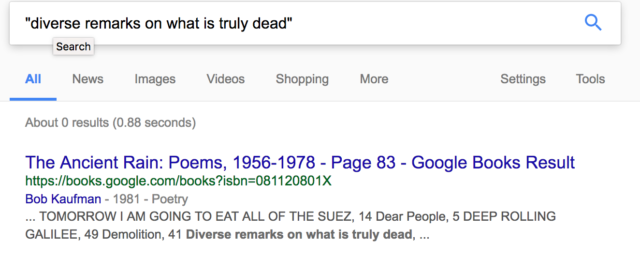
Yep, that “about zero” result is the same edition as the scan. You’re on your own.
So you read, you consider, you do the best you can: Make your choice and don’t lose too much sleep over it. Your hanging indent shouldn’t be a Sword of Damocles. Keep in mind, though, that it only gets muckier from here.
Put your corrections, complaints, and calumny in the comments. In Part Two, I’ll be looking at poetry that uses deep and idiosyncratic indentation, and different approaches to styling them for ebooks.
”Aim” By Guillaume Apollinaire, translated by Roger Shattuck, from SELECTED WRITINGS, copyright ©1971 by Roger Shattuck. Use by permission of New Directions Publishing Corp. ”The Hostage” By Stevie Smith, from COLLECTED POEMS OF STEVIE SMITH, copyright ©1972 by Stevie Smith. Use by permission of New Directions Publishing Corp. ”Tropic Ritual” By Denise Levertov, from CANDLES IN BABYLON, copyright ©1982 by Denise Levertov. Use by permission of New Directions Publishing Corp. ”Spliced Reflections” By Robert Kaufman, from THE ANCIENT RAIN, copyright ©1981 by Bob Kaufman. Use by permission of New Directions Publishing Corp.
Heh! Yes, I’ve been through most of this. “Run away and don’t look back” seems like pretty good advice. 😉
I will say that as old MOBI7 Kindles have become less dominant, this has become a bit easier; KF8 follows ePub3 closely enough that most of the formatting translates fine. But… Oh, man. @media queries. :shudder:
[…] *If the negative text-indent looks weird to you, check out my last post. […]
[…] hanging indent kicks in, keeping the last line of the triad together. Because ems are used, the indents stay […]
Thank you so much for this amazing tip!