InDesign Best Practices for EPUB Exports
When faced with ridiculous deadlines and last-minute, messy copy from editors, designers may resort to bad InDesign habits. Here are some basic InDesign best practices that are especially important to follow when the file will be exported to epub. While there are ways to clean up the problems caused by not following these guidelines, it pays to follow them from the start. And if you’re just too damn busy designing, you can hire a professional typesetter (hi!) to handle all of this quickly and cleanly. Your clients will thank you for providing squeaky-clean files.
Styles
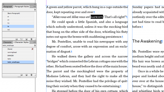
Paragraph and Character Styles are usually translated to CSS for epub, so you should use them to format ALL of your text. Local formatting should never be used.* I’m sure you’re already using an italic character style, but if you also need bold italic or small caps italic, be sure to create new character styles.
* The one time I do use local formatting is for text fitting. If you have to adjust tracking on some text in order to make things fit better, it’s ok to do this locally because this is not something we want to carry over into the epub.
Spacing
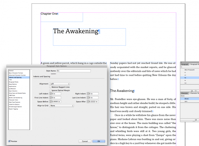
Instead of adding empty paragraph returns for spacing around elements, use Space Before and Space After in your Paragraph Styles. Use First Line Indents instead of tabs or spaces.
Text Frames
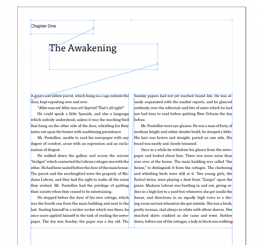
Keep text frames linked as much as possible. Don’t use unlinked text frames for chapter number, chapter title, etc.
File/Style Names
Don’t use spaces or odd characters in file names or style names. Stick to letters, numbers, and underscores. This script will rename styles for you. (Learn More about this script in our EPUBSecrets post.)
Text Flow
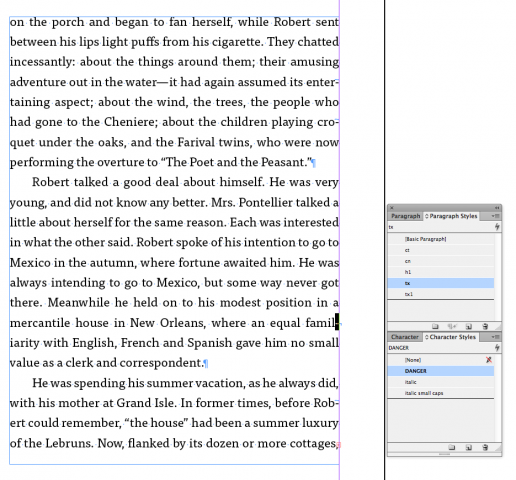
Do not type hard hyphens to force a word to break where you want it to. There are better ways to rebreak words, such as using discretionary hyphens. If, however, there really is no other way to get the break you need, make sure you do two things: 1. Place a soft return (shift-return) directly after the hard hyphen. 2. Create an empty character style called “DANGER” and apply it to the hyphen and soft return. That will help your friendly neighborhood ebook designer find the problem areas in your files.
Master Page Items
Master page elements are not exported to reflowable epubs, which is mostly a good thing. You don’t want running heads and folios showing up in the middle of paragraphs in a reflowable epub. So, instead of overriding master page elements in order to change them, create new masters and make changes there. For example, you may need to create a master page for each chapter of your book. Or, you could use Variable Text in your running heads and have only one master for text pages. I discuss Variable Text for running heads in more depth here: http://tinahenderson.com/2013/01/10/the-basics-how-to-create-running-heads-in-indesign/
Fonts
If you’d like to use the same fonts in the epub, make sure you’re not using Postscript Type 1 fonts. Stick to True Type or Open Type fonts. If you are a Creative Cloud subscriber, you can sync those fonts and use them in both print and digital publications. Otherwise, ebook-specific font licenses may need to be purchased.


“discretionary hyphens”
which are also problematic by the way, as they will appear as
[space][endash][space]
in iBooks, may the discretionary hyphen happen at the end of a line—sure, we want the discretionary hyphen to happen in this particular case, but not as it currently does since readers could think it is an interpolated clause or anything unlike an hyphen.
Worst of all, the discretionary hyphens won’t actually show in some editors, which means they will go under the radar during e-production.
Thanks for a most helpful article.
Any suggestions about handling line breaks with gosh-awful long web links, particularly in footnotes where they are getting more and more common? I working on two books now where over half the footnotes include web links.
Doing something that adds a hyphen is an absolute no-no, since it will look like part of the address. Than means turning of hyphenation and not using discretionary hyphens. ID will break web address, but it seems to do so only for non-alphabetic/numeric characters such as /, _ and -. The result can be a line with far too much whitespace.
I’ve suggested to Adobe that they come up with Smart Hyphenation that knows how to spot and handle http address. But until then we need a workaround that works for print and epub. I’ve been fixing the problem by rewriting that footnote to make a line break better, but that’s only going to work with a specific page width.
Hi John,
Where do you see space en-dash space? I get []. At any rate, they are easily stripped out either in InDesign or in html.
Michael,
I use soft-returns to break long urls without hyphenation. You are lucky to be in a position to rewrite!
I thought that might not work. I get (without spaces) & # 1 7 3 ;
Quote: “I use soft-returns to break long urls without hyphenation. You are lucky to be in a position to rewrite!”
Oh, most of what I layout comes from scientists who’re only too happy to have what they do cleaned up. They like footnotes that are just web links. I have to add the authors, titles, publication etc. It’s a grind.
But won’t those soft-returns create issues with reflowable epubs? I know that when I use soft-returns to break the lines in chapter titles properly, I get frustrated when those soft-returns migrate to the book’s contents. Adobe needs to add an option to filter out soft-returns when generating a table of contents.
Yes, but soft-returns are easy to strip out, either with Find/Change or by checking “Remove Forced Line Breaks” upon export.
Or you can leave them in through export, and later replace them with zero-width spaces (& #8203; or & #x200b;) so that the URLs will wrap at appropriate points in the e-book, too. (Test, though, obviously; so far, I’ve found this character to be supported, but you never know.)
If you use a char. style set to [No Language] for URLs they will break but spurious hypens will not be inserted even if para. is set to hyphenate. Not that the breaks are always ideal, esp. when para. is justified, but I’ve found a bit of tracking often fixes the problem.
LTM
Thanks for all the helpful suggestions about breaking long hyperlinks. Perhaps the most useful is that to set a No Language character style. Breaking anywhere without a hyphen is what I need. I might even be able to make it a part of my hyperlink styling.
The No Language attribute is a great tip for setting URLs.
FWIW, there is also a zero-width line break (soft return) character in InDesign, a discretionary line break, which behaves similarly to a discretionary hyphen … adds a line break when necessary, “goes off duty” when it’s not needed because of where it falls in the line.
It can be used in combination with the No Language option. If InDesign breaks the URL but leaves too much white space, and there’s another logical place to break in the next line, you can insert the character there and the line will break where you put it, bringing some text up to the previous line. Find it in Type > Insert > Break Character.
The disc line break character is ignored (stripped) when exported to EPUB (Reflowable). No entity replaces it or anything.
As far as discretionary hyphens and iBooks, I’m not encountering the problems John (the commenter) is. It appears to be treated correctly, just like a discretionary hyphen. It gets converted to “& #173;” (no quotes, no space) in the HTML. (Earlier versions of InDesign exported them as “& shy;” which sometimes caused problems.) We normally don’t strip those out of ID files when exporting.
(Aggravating that the “< code >” option isn’t working here. I’ll investigate.)
(Oh and by the way, excellent post, Tina!)
Thanks, Anne-Marie, Lindsey, and India for the great tips!
This is the tip that blew my mind. Like all great ideas, it seems completely obvious once you pointed it out:
“2. Create an empty character style called ‘DANGER’ and apply it to the hyphen and soft return. That will help your friendly neighborhood ebook designer find the problem areas in your files.”
Right there, you’ve probably saved me an hour or two on my next ID–>EPUB export. Thank you!
Best,
Artie
Bicycle Comics
& The Yellow Buick Review
[…] for the Art of Ebook event at the Type Directors Club on October 9. Joining me will be EPUBSecrets contributor Tina Henderson and the always inspiring Peter Meyers. Charles Nix will be moderating (his talk at […]
I love it when Anne-Marie pops in and saves me from having to type out my comments on the discretionary line break.
Nice article Tina, love all the helpful comments as well.
Sorry, get it in iBooks if discretionary hyphen from ID is used.
In other words, [space][hyphen][space] at the end of the line if I don’t get rid of discretionary hyphens in InDesign. Sorry about en-dash which was wrong. People have been mailing us to report readability issues as they thought it was either an interpolated clause or remaining hyphens.
But, for whatever reason, that doesn’t happen with
­.Hi, I’m new on this, so here’s my question,
Why can’t I use unlinked text frames for generating an epub?
Would I have a mayor problem if I leave this advice out?
Thanks in advance for your answers!
Hi Tina
When you say ‘If you are a Creative Cloud subscriber, you can sync those fonts and use them in both print and digital publications’ are you referring to fonts accessed via TypeKit?
Thanks
Phil
Yes, exactly.
Hi i would like to ask how to make the cover as first oage in kindle using indesign.. it always turns to title page.. and how to enable the navigational table of contents.. because I only have hyperlinked table of contents inside.
I am exporting a novel as reflowable epub with indesign and when I test it with the viewer app, I find that the pages every now and then do not end on the same line. This means that on page number 5 the text box end one line before compared to page 6.
have you any idea why is this happening?