So You Think You Can Code: 2017 Edition
Kristin Brodeur tells how she won the ebookcraft challenge
Starting in 2016, the ebookcraft conference has included an ebook design challenge, “So You Think You Can Code.” In 2017, the winner was Kristin Brodeur of Houghton Mifflin Harcourt. In this Q&A, Brodeur describes how she designed the winning entry, and she shares the original file, and her winning redesign.
This is a guest post from Stephanie Argy, a graduate student in Portland State University’s book publishing program.
Can you tell us a little bit about your background and how you got into making ebooks?
I had known as an undergraduate that I wanted to go into publishing, but I wasn’t sure how to break into it. One of my professors had mentioned the graduate school for publishing at Emerson College in Boston, and after I looked into it, it felt like the right place for me to go. I went there for grad school and while I was there did a few internships with various companies in the area. When I graduated with my master’s in 2012, I got a job at David R. Godine Publishers, an independent publisher in Boston. I was there for a year, on the print side, though I also managed their ebook program. At Emerson, I had taken classes that dealt with electronic publishing, so that was where I got my first taste of ebooks and what they involved. At Godine, I got a little bit more. They had just started doing ebooks, and we were trying to expand that, but it was very early stages at that point. We mostly used an outside vendor to make the ebooks for us.
Then about a year after I started at Godine, a position at Houghton Mifflin Harcourt came up in the ebooks group. Through a contact at Emerson, I knew one of the women on the ebook team, so that was an in to get into the interview stages. Obviously I got the job and moved over to HMH. That was my first deep dive into ebooks. I had the basic knowledge from my classes and some of the experiences that I’d had Godine, but I hadn’t had a ton of hands-on experience up until that point. A lot of what I’ve learned has been on the job and learning as I go, and learning from my boss, Teresa Elsey, and from my coworkers. In my department, there are six of us—two on the young reader side, two on general interest side, one on cookbooks, and my boss.
How did you find out about the “So You Think You Can Code” challenge? Had you done it before, or was this the first time?
This was the first time. I found out about it through my boss. She has gone to the conference in the past and would normally be our group’s representative at the conference, but she was eight months pregnant at the time, so she wasn’t going to be traveling out of the country. She asked if I would like to go in her place, since I’ve been on the team longest other than her. So I was obviously excited about that.
Initially I wasn’t planning to enter the contest; I thought, “Oh, it’s a lot of work, and I don’t know how much time I’m going to have.” But then Teresa said, “It’s not going to hurt to enter. If you don’t have time to finish it, then you don’t have time. You could always just enter and try.” And I thought, that’s a good plan. So that was my inspiration to go ahead and try.
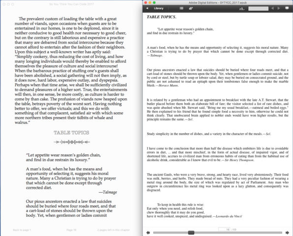
Left: Kristin’s EPUB in iBooks. Right: The before EPUB in Adobe Digital Editions. Side by side displays of the before and after ebook, showing the design and smoother flow of the book after Kristin worked on it.
When you first opened up the file and started looking it, what were the things that jumped out at you, and what was your plan of attack for doing the work?
It was very plain and bland and not very attractive-looking, which I understand was the point. There was lot of unnecessary spacing between the lines, which made it clunky and not easy to read, so that was an easy fix, and one that I knew would make a big difference. The images were weird sizes, and they weren’t great quality. There wasn’t much I could do with that, since it was an old public domain book, but I wanted to make sure to present them in the best way they could come across, which was clearly not how they were in the original file.
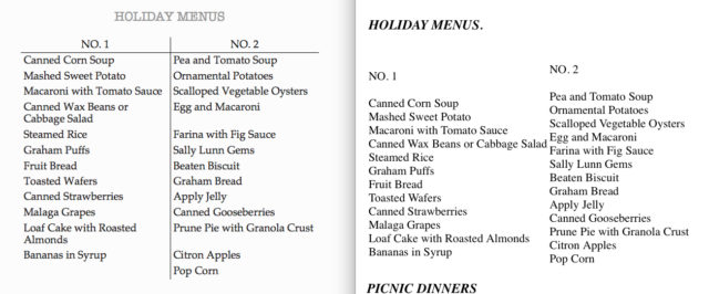
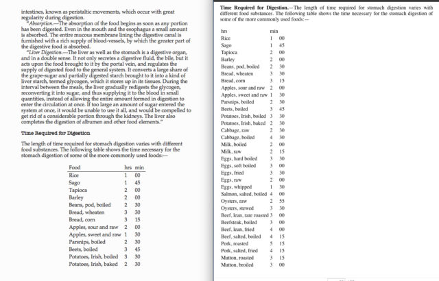
The biggest thing that stood out about this book was that it had a ton of tables in it. In the initial file, you can’t actually tell how many tables there are, because there’s some kind of error at some point, so you only see a few of them before it cuts the rest off because it doesn’t know how to render them. Once I opened the file and saw the HTML, I realized how many charts there were. That was probably the design element that I spent the most time on, because I wanted to make those as clean and readable as possible. They were charts for menus for the days of the week, and there were a lot of different elements to them. The way they had been presented initially, the days were running together, and it was not very clear what went where. So I reformatted all those tables and added border lines to some of the edges to make them more visually clear. I spent a good chunk of time with that.
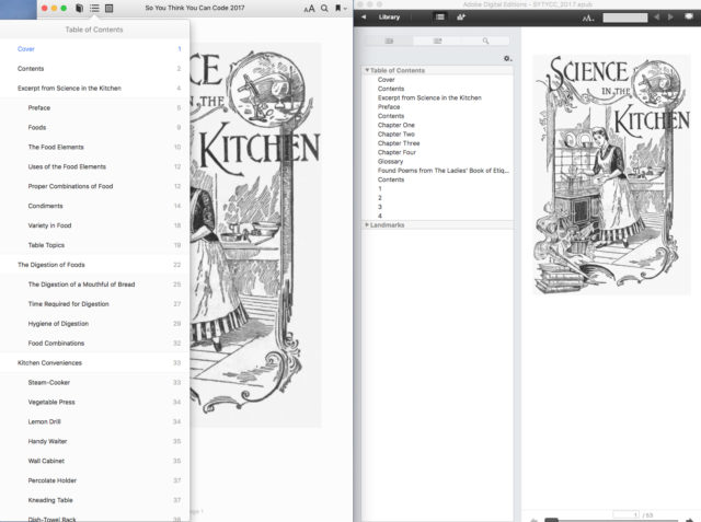
Left: Kristin’s EPUB in iBooks. Right: The before EPUB in ADE. Demonstrating the much fuller navigation baked into the EPUB.
Did you do a lot in terms of HTML, adding semantics and accessibility features?
One thing they specifically mentioned in the instructions was to be aware of semantics and accessibility. Accessibility-wise, I made it a point to go through to add alt text to all the images, so there would be a way for someone visually impaired to understand what’s in the images.
And then I added some semantic inflection. Had I had more time, I probably would have done a little more with epub:type tags than I ended up doing. But I tried to at least add some kind of semantics there.
What was your approach with the CSS, and what kind of decisions did you make there?
I took some inspiration from HMH’s standard CSS. For instance, we have a very similar table of contents to the one in the book used in the challenge, so I looked in some of the books that we’ve worked on and took some of that code over so that the table of contents would be cleaner looking and more designed than just a page with a bunch of links in that lovely blue color. I also wanted to make the headers on each page a little bit more designy, but I didn’t want to embed fonts, because you don’t know what device someone is going to be opening it on, and how that’s going to work. I don’t personally have access to a lot of fonts that I own, so I didn’t want to get into rights issues. I ended up calling out a monofont, American Typewriter. It reminded me of the time period that the book was from, so it felt appropriate to me from a design standpoint. I wanted to play with color to make it more interesting, but because it’s such an old book, I didn’t want the color to feel out of place; I mostly played around with different shades of gray to give it just a little something but keep it simple. It was also a good choice for device compatibility, so I felt good about that as well.
Showing the vast improvement on presentation of lists in Kristin’s EPUB (left) from the supplied EPUB (right.
Did you have to worry about devices like Kindle, or was it basically meant to stay in EPUB?
In the challenge, they want it to look as good as possible across as many devices as possible, so I definitely did think about Kindles. I don’t personally own a Kindle, so I used Kindle Previewer on my computer to see what it would look like and make sure nothing was broken. I know from my daily work life that you can have something that looks amazing on the iPad, exactly what you want, then you go to Kindle Previewer and it’s completely broken. So I definitely checked to make sure it was acting the way I wanted it to act.
That’s also why I tried to keep it a bit simpler, in terms of not embedding fonts or doing too much with color and other things. I knew that had better chances of rendering correctly across different devices.
In your professional life at work, do you make choices in the same way, leaving out embedded fonts and not using colors, or are you able to use those a little more?
It depends on the book. For the most part, I’ll only embed fonts when we’re doing a nonfiction title, and even then, I’ll just embed them for titles or headers, so that if it doesn’t work it’s not going to be the end of the world.
Every now and then, we do have books where we use specific fonts. We had one in particular about a character who had multiple personalities. He heard different voices in his head, and that was distinguished in the print book by using different fonts. So that was one piece where we had to keep the different fonts embedded, because it actually does affect the reading of the book and the understanding of the plot. But obviously that’s not something that comes up super often.
With fonts, we try to think, is this necessary? Is this going to help the book? Is this going to hinder anyone’s experience? And then we’ll make decisions from there.
I do use color from time to time, but again it’s more for non-fiction titles that are highly designed. And we do try to be aware of how that color is going to render when someone is viewing the book in sepia mode, or in night mode, or any of those things, just to make sure that nothing breaks.
One thing that people don’t necessary consider is that if you set text in CSS to black, then it’s not going to show up in night mode when the whole screen goes black, whereas if you leave it at the default, it’ll automatically change that black default text to white. So there are various things like that that we definitely do when we’re making our ebooks at work.
Showing how Kristin spiffed up the tabular content. Her ebook is on the left, the original on the right.
In the description of the challenge, they mentioned certain curveballs that might be thrown at you. Did you have any of those?
Yes! One of the big things was that while I was resetting the tables, there was some nonsense text thrown in. I ended up Googling the title of the book, and I found a website that had all the text listed out. I was able to cross-check against that and find what the actual text was supposed to be, and then put that back into the book.
I noticed that in the text itself, there were page markers for the print pages, but I didn’t see a page-list. Is the page-list something you don’t use?
Whenever our ebook team has meetings at work, we keep coming back to page-list. It’s not something that we’ve done at HMH before, but it’s something that we’re aware of; as we continue to go forward, we may incorporate that into our process a little bit more. As I was running out of time for building this ebook for the contest, it was something I didn’t end up getting to.
Are there other things that you would have done if you’d had just a little bit more time?
I’m the type of person that can always find something else to tweak or fix. Maybe I would have done a little more design, if I’d had a little more time to think things through. I definitely would have added more with the page-list and the semantic inflection, and I probably would have seen if there was more I could do accessibility wise. But at a certain point, it was good to have the cut off, because otherwise I would just keep going with it.
There’s always more that can be done with anything. But I asked myself, if I was reading this book, how would it appear cleanest to me? How would it be more appealing as a reader? I focused my edits from that standpoint first, then went outwards and used the time I had left to make extra tweaks.
At work, we have deadlines that are generally a lot closer than the one for the contest, and my boss is good at reminding me that each ebook doesn’t have to be fancy. I feel that with a lot of people who work on ebooks, maybe the instinct is that you want to design it and make it look really nice and look like the print book. That’s great if we can do that, and I like to do that when I can, but you also have to find a balance. You want it to be clean, so that if the CSS wasn’t connected to it and all you had was the XML with whatever the device’s basic CSS was, it would still come through clean and be something that would be a pleasant reading experience for the user.
Another thing my boss has said to us is that if in ten years from now, these devices lose everything but the basics, we want to make sure our basics are as strong as possible. That’s what my initial goal is: to make sure the XML, HTML, all that stuff, is as clean and good as possible, then add in the design elements and the bits and pieces, so it looks even better. But if for some reason, people can’t see that part, they’ll still think it’s good.
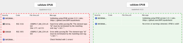
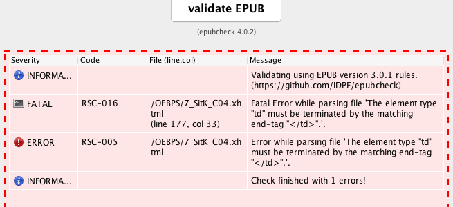
Validation reports side by side. One has a fatal error, the other validates.
When did you find out that you had won the challenge, and how did you feel about it?
I was there at ebookcraft, and we were sitting there at the end of the second day, and they went up on stage to announce it. I had no idea until then, and I was shocked, because I really wasn’t expecting to win at all. I thought, “Oh, my gosh, now I have to go up in front of whole room of people!” That was a little nerve-wracking, but it was worth it. It was actually really cool, because I was there with one of my former co-workers from HMH, who now works with Harper Collins. She was there to celebrate with me. And then when I got back to my table, my boss had already texted me, “Congratulations! So exciting!”
Has winning the challenge changed anything in your life in a broader way?
I was able to get a new laptop, so I can work at ebooks at home. When I got back to work later that week, everyone was really excited for me. It was cool to raise the profile of the ebook team a little bit within our own company. We know some of the people on the print side, but we’re always striving to put ourselves further up in their consciousness, so they’re hopefully thinking of ebooks a little bit more while they’re working on the print books, and it can be easier and more integrated once it gets to our part of the process. So it was nice to help with that a little bit, where ebooks were mentioned a little bit more.
Think you’re up to the challenge? There’s still time to sign up! Read more about one of the only ebook design contests around at this link:
https://www.booknetcanada.ca/blog/2017/10/24/so-you-think-you-can-code-2018
STEPHANIE ARGY is a writer, editor, and filmmaker who lives in Portland, Oregon. She has a master’s in journalism from Columbia University and is currently getting a second master’s in book publishing at Portland State University, where she is specializing in digital publishing and emerging forms of narrative.
[…] Вот подробное интервью с одной из победительниц конкурса, дизайнером Кристин Бродёр из издательства Houghton Mifflin Harcourt. С примерно вот такими картинками, которые очень внятно отвечают на вопрос, чем хорошо свёрстанная электронная книга отличается от свёрстанной плохо: […]