Post InDesign Remediation of EPUBs

So you’ve made an EPUB from InDesign and it looks reasonably okay. Can you ship? Well, you can do anything you want but I would suggest that there is still some heavy lifting that must be done before you send it to the stores. And in the interest of well-made EPUBs, I am going to nudge you with this list.
Editing an EPUB
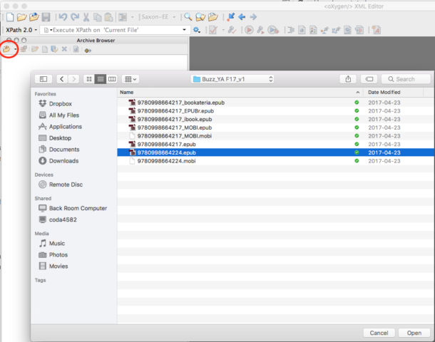
There are lots of ways to edit ebooks (see the list of XML editors at the bottom of this resource page: http://epubsecrets.com/resources). Some editors will let you open an EPUB without unzipping. oXygen is my preferred editor and allows this (in addition to pretty snazzy validating on the fly).

If you are using a different text editor and need to zip/unzip, eCanCrusher is a simple and free drag and drop utility to make the process an little easier.
If you don’t edit EPUBs regularly, start getting your hands dirty. Get used to looking at HTML and CSS and stop being afraid of code. If ebook development is your work, it’s past time for this.
CSS
InDesign is rather terrible at CSS. In fact it’s fair to say that the “cascading” part of CSS is elided altogether in the CSS that ID compiles for content. A best practice for any workflow would be to write a custom CSS for your ebooks that is individualized on a book or series basis. If that’s not likely, then I suggest that you edit the heck of what InDesign serves up. Some suggestions:

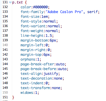
- Delete any colour declarations for black; i.e color:#000000
- Build a bigger font-stack for the base text and any font transitions, say, between serif and sans-serif fonts.
- Avoid declaring font size for base text: font-size:1em. It may interfere with the ability to increase font size in some reading systems. The base text in any EPUB will be 1em by default. All other font sizes will be relative to 1em.
- Consider deleting anything that is secondary and overkill. The page-break declarations in the above samples aren’t necessary. Neither is text-transform: none or text-decoration: none.
- For the base text, you can leave the font-style, font-weight, and font-variant definitions but they aren’t necessary.
- Consider collapsing the margins definitions to something tidier and more responsive like margin: .5em 0 .5em 0.
- The orphans and widows are pieces of hopeful code that only work sporadically if at all.
- All other class definitions should be in comparison to the base declarations. So, if the font size is bigger, bolder, more indented, declare it. All other definitions should cascade from here.
Overrides
No matter how cleanly styled your content is, InDesign has this annoying habit of spitting out a full repertoire of HTML and CSS overrides. Clean them all out. Every single one. Otherwise, CSS that you aren’t fully aware will be acting on your content making it behave in unpredictable ways.

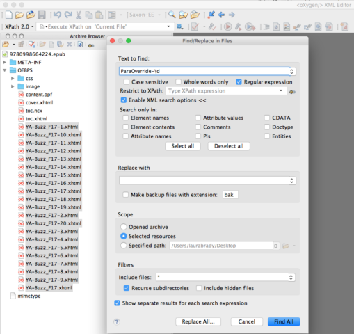
In my workflow, I run RegEx searches on all the HTML files in any ebook looking for “ParaOverride-\d” and replace it with nothing.

Once you are done cleaning up the HTML markup, don’t forget to clean all the corresponding CSS.
Consider using object styles in your content to squeeze <aside>, <figure>, <figcaption>, and <section> tags out of InDesign (explained in detail here). If you haven’t done that, edit those generic <div> tags to be more specific and machine legible.
Metadata
There are several pieces of metadata you might consider adding to the OPF of your ebook. It’s not possible to get separate subtitle metadata out of InDesign so add that. You might consider adding fuller author declarations: editor, illustrator, co-authors, translators. Clean out any extraneous language metadata that may not be relevant. (I have a client who must re-use the same Word template over and over. Despite writing in English, there is always a top-level Spanish language code in the metadata.) There is a series of accessibility metadata which can be added to ebooks which meet a11y standards, but I will save that for a separate post. If you’ve carefully compiled a page-list in your ebook, then be sure to add a source ISBN to the OPF. I often use FlightDeck to edit the metadata.
Navigation
The nesting of navigation levels in the toc.xhtml may not have exported smoothly from InDesign. Consider remediating the nested lists in the toc to get nicely nested drop-down navigation. If you didn’t apply epub:type semantics from InDesign (learn more about how here), consider adding more to the navigation and the HTML now. You can find the definitions of a full set of epub:type semantic inflection here.
Images
If the ebook is image heavy, consider extracting the images folder and running it through compression software like ImagOptim. This will save file space and create an easier to use ebook.
If you’ve carefully applied alt text in your InDesign file, then your images are described and your content meets that accessibility threshold. If not, consider adding descriptions to images at this point. Remember: the cover and any logos should be described in addition to other image-based materials in your ebook. If your images are complex and need long descriptions, now’s the time. The Diagram Center has an excellent sample book from which you can repurpose code, if need be.
What else?
Tell me more about your post-export process in the comments. I’m sure you all have tips and tricks that the rest of us can learn from. Please share!
No, sorry. I pay lots of money each month to Adobe. Fixing these problems, as well as keeping up with a steady stream of improvements is their job not mine.
And since they’re not doing that, I’m playing a different role. I’m doing my best to steer other publishers and authors away from InDesign. When Adobe again delivers, I will support it. But not until then.
I firstly go through the CSS if some of the para/char/td-overrides do some useful stuff (specially background-color of ) and then I delete the unnecessary.
Also remove unnecesary closing and again opening tags like or
And I’m just curisou – you really use instead of ?
So what SW do you use?
[…] Laura Brady and several other authors have been writing some terrific pieces at epubsecrets recently! Check out this one on the present and future of ebooks. Or this one on “Post-InDesign Remediation of EPUBs.“ […]
If you’re familiar with Bash/Shell (or any other scripting language) you should try and write a cleanup script which handles most of the recurring tasks after ID export.
Bash can unzip, perform tasks like Regular Expression search/replace, add/delete chapters, alter the OPF and TOC (better do this with XSLT) an zip up the EPUB again.
Every task which can be automated is worth the effort!
I write some Sigil Plugins in python for this.
The problem, as I see it, is that Adobe is trying to get an ebook to look “right” to a designer who doesn’t know anything about ebooks, and who probably isn’t good at setting up files for print, either (a huge number of print designers are terrible at it, no matter what they think). So you get twelve tons of overrides–and, more recently, ids–so Adobe can say InDesign exports ebooks. Which it does. And then those same undereducated people complain about this or that not looking “right,” so Adobe adds the only thing they can add: More overrides.
The goals of having an ebook look good to the uneducated (requiring minimal post-export work) and having an ebook work correctly under the hood (requiring competent pre-export work) result in different kinds of export. Adobe has chosen the former, making InDesign less professional for designers, but more appealing to purchasing departments. What they should do instead (which they take a quarterhearted stab at, by allowing a CSS file to be attached during export), is let the user toggle which kind of export they want: Brain-dead or pro.
[…] to export cleanly coded ebooks. I would go so far as to say that the ID export needs a lot of heavy lifting to turn it into a well-built […]
Unfortunately, as of right now, we don’t let InDesign write any code, we use our own CSS and clean up from there. We have tried hard, working backwards from the epub, to figure out what overrides we can use in the print file, but will drop out in the epub and not be noticed (usually spacing, small caps for design purposes, etc.) The templates we use to set books have been tweaked over the last several years to incorporate styles and export tags that will result in a very clean epub. It takes time and alot of trial and error, but it’s worth it! (and much thanks goes to EPUBsecrets and the Twitter eprdctn group for providing so much useful information over the years!)