Ebook Design Is Not an Oxymoron

Let’s talk for a moment about what an oxymoron is. It is a figure of speech in which one or two words that seemingly contradict one another appear side by side. Oxys means sharp, and moronos means dull or stupid so the word itself is an oxymoron.
Does ebook design belong in this category? I have an opinion that I bet you can guess at, although it is almost certainly more complex than you think. Let’s circle back to this.
Ebook Design Nihilism
There is an insanely intense internal tension in ebook design: how do you design knowing that your end user is going to change everything – the font, the leading, the type size, the background, even whether or not the text is justified. Despite the chaos of this fact, and the anxiety it gives designers, this is truly one of the main advantages of ebooks. They are a kind of blank slate waiting for the reader to layer their needs on top of that bare structure. So, for example, a dyslexic reader can use a font that makes comprehension a little easier. And a print-disabled reader can convert the HTML to Braille output, or have a screenreader voice the text. I know I am repeating myself here, but truly this is one of the key affordances of ebooks: they are what the reader needs them to be.
One of the key affordances of ebooks: they are what the reader needs them to be.
And while I have long proselytized that a good ebook is one that is well-coded and ready for the user’s preferences to be layered on top of that solid framework, I am excited to bring this message as well: ebooks can be a thing of beauty, too.
A well-designed ebook is not just one that is typographically sound – although that counts – but one that is clean, lean, and agile. The HTML is as simple and clean as possible using semantic HTML 5 so that the markup is making as many formatting decisions as possible. There is a bumper crop of ebooks up for sale about which this cannot be said. The HTML is too generic, full of complex CSS definitions that override the internal <div>-<span> soup. These kinds of poor markup practices will get in the way of device fragmentation, conversion to other uses, and will not hold the structure and style as intended.
With that in mind, I propose that the big three of ebook design are:
- Use fonts designed for screens
- Mind the principles of interoperability
- Responsive design
Typography on Screen
The needs of screen reading are very different form print on the page. You have likely noticed, for example, that you set type much larger for screens than for the page. Larger type size is just the start of how the needs of fonts on screen differ.
So let’s begin at the beginning and talk about fonts. Print fonts are designed for print. They have areas in their various faces that are designed to accommodate ink squeeze or dot gain. When these typefaces are used on screens, their blocks of text can look pallid, spindly, and hard to read. Details such as thin hairlines or serifs can become very faint and hinder readability.
This is where font hinting comes into play. A good digital font has been hinted, a process that is critical to screen legibility. The image below shows a font test without hinting (upper rows) and with hinting (lower rows) at 100% and 400%. The hinted version has increased edge contrast and greater general legibility on your screen.
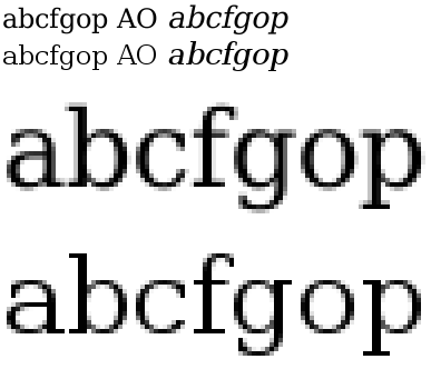
A font test without hinting (upper rows) and with hinting (lower rows) at both true size and 400% scaling. Note the increased edge contrast with the hinted text but more faithful character shape and more natural inter-character spacing in the unhinted text. (From https://en.wikipedia.org/wiki/Font_hinting)
The other major area of improvement in a well-made digital font is the x-height, that is, the height of the lowercase x in any given typeface at any given size. X-height provides a way of describing the general proportions of any typeface. Large x-heights generally make a typeface more visible at any given size. Display faces with very large lowercase characters tend to communicate with clarity and emphasis. Text typefaces that incorporate large x-heights generally do so in an attempt to increase legibility and readability. These images from Charles Nix’s 2016 ebookcraft presentation demonstrate this perfectly.
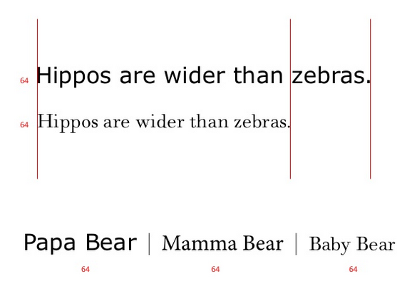
Display faces with very large lowercase characters tend to communicate with clarity and emphasis. Text typefaces that incorporate large x-heights generally do so in an attempt to increase legibility and readability.
A large x-height is not a universal marker of a well-made digital typeface but it is an important consideration when choosing a body typeface for content destined for screens. The hallmarks of a good body font are the same as one would look for in print: even colour, regular spacing, and slightly open. The two most noticeable things in text are texture and colour.
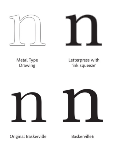
A vivid illustration of one letterform from metal type drawing, with ink squeeze emulated, in print, and as a hinted eText font. (From Steve Mattson’s 2015 ebookcraft talk, “Type 3.0: The Future of Typography” https://www.slideshare.net/booknetcanada/type-30)
Some basics of using fonts built for screens:
- The base type size is bigger than for print. My advice is to leave the base body font size undefined. it will default to 1 em and other CSS definitions will cascade from 1 em.
- Avoid hyphenating and justifying text. The built-in hyphenation dictionaries stink. And justified text on a small measure can be disastrous for legibility.
- Don’t use paragraph indents in addition to space between paragraphs. Pretty please? One or the other will do. Both will mark your content as unprofessional.
- Use non-breaking spaces between words to force lines instead of shift-return (in InDesign) or <br/> code.
- Pay attention to line height. Use good defaults that respond to the font called for in the ebook. Fonts with large x-heights take up more screen real estate and generally require more leading, for example.
The easiest and more visible improvement you can make to your typography is to use a professional font. If you have a Creative Cloud subscription, you have access to a boatload of Typekit fonts, many of which are available for embedding in an ebook. Monotype has of of the largest repositories of fonts built for screens – and is more affordable than they used to be with monthly subscription models.
Pay attention to end-user licensing agreements to make sure that when you buy a font that you are also buying a license to embed that font in an ebook. There are as many EULAs as there are font foundries and with about as many complications as well.
Interoperability
What the heck does this word even mean? In order to ensure that your ebooks work across the device spectrum, I advise keeping the styling as simple as possible. You can pull off some pretty cool tricks in some reading systems that will fall utterly flat in other rendering environments. Or might even break completely.
As the goal of most ebook development work is to produce one EPUB file that works everywhere, including conversion to Kindle formats, bearing interoperability in mind is especially key. The work of one especially wonderful R&D eprdctn-eer has taken all the mystery out of this process. The Blitz CSS framework, author by Jiminy Panoz, is a base CSS whose core principles are to work with and through the defaults of various reading systems. Jiminy’s goals are aligned with mine: to help developers make more typographically sound ebooks.
In my experience, it is possible to make one ebook that works well everywhere. It is much easier than it was a few years ago, partly because the marketplace is more homogenous. And you might not want to hear this, but testing is key to achieving interoperability. You need to approach ebooks like a mischievous child, try to stretch, poke, maul and break them. Load your ebooks onto as many devices as you can get your hands on – Kindle, Kobo, Nook, iBooks, mobile apps from all those vendors, etc. Flip through your ebooks on high-resolution devices, on e-Ink devices, on phones, and on desktop computers. Any out-on-a-limb design tricks that you try should be rigorously evaluated in the wild to see how rendering differences are going to impact the reading experience.
Sidenote: It is possible to use Open Type fonts that support open type features in some reading systems. The bad news is that it won’t work on all reading systems. If you are only publishing to iBooks, knock yourself out. If you push to more retailers than that, the principle of interoperability will prevent you from using open-type features more broadly.
I would suggest that you build a base CSS upon which you layer your design. Avoid using the CSS that InDesign exports (see illustration below). And stand on the shoulders of developers like Jiminy who have stubbornly invested the R&D time in developing a framework that has interoperability principles at its core.

InDesign’s CSS is not usable. Consider ditching it altogether in your workflows and creating a basic CSS, perhaps starting with the Blitz CSS.
Responsive Design
With the rise of mobile devices and now tablets, we have to give up this shared hallucination that we have all been operating under, that we have any control over the presentation. That we have any control over the size of somebody’s screen or the layout that they have or the input mechanism that they’re going to be using. That’s gone. And it’s not coming back. – Karen McGrane
Okay, let’s talk about responsive design. The quote above is from a disappeared article on responsive web design from the great Karen McGrane. Because you can not only not exert any control over how your ebook are read, neither can you control the screen size that they are rendered on. The nature of reflowable ebooks is, well, that they reflow. This is a hard message for anyone from a print background to swallow. Give up control over how the content is displayed but trust your semantic markup to do the design heavy lifting.
Give up control over how the content is displayed but trust your semantic markup to do the design heavy lifting.
The essentials of responsive design in an ebook context are:
- Use percentages or ems wherever possible. Avoid hard pixel sizing definitions. The applies to fonts, margins, indents, and image sizing.
- Relative is always better than static. If an image is defined as 80% of the width of a screen, it will be 80% of the screen width, no matter the size of the screen.
- Understand the cascading part of Cascading Style Sheets and leverage it. Build on it.
I hope it goes without saying that you should avoid inline styling, which will interfere with usability at a very basic level, making your content inflexible, anti-responsive, ad with interfere with both legibility and accessibility. If you use inline styling, you might get a pop-up message with my grumpy face on it asking if you really want to ruin the ebook you are developing.
Sidenote: It is not possible to achieve these goals with a direct export from InDesign. Just because it works and seems to render well in a few places, does not mean that it’s sound. ID-generated HTML is a starting point and needs intervention – cleaning up by removign overrides and sometimes classes, swapping out or heavily editing the CSS, remediating the ehader HTML, etc. InDesign won’t give you HTML 5 tags by default; it will generate the most vanilla, unsemantic <div> + <span> soup. Please bear that this in mind if you use InDesign in your production workflows.
Ebook Design Is Indeed Not an Oxymoron
While not as straightforward as a pleasing page design, or interesting typeface contrast, ebooks can indeed be well designed. In my estimation, it has just as much to do with what’s under the hood as with how the content is presented. An ebook that uses sound semantic markup, is designed with intent for screens, works well across the device spectrum, and is responsive to screen size checks off all the requirements of good ebook design.
Header photo by Vlad Sargu on Unsplash
A big issue I see with books is how they deal with certain images. A photograph of a person scaled to a small size works. A map scaled to a small size doesn’t work at all.
Is it possible to find the x-height and hinting of a Google font? Are there different concerns for web fonts vs. ebook fonts? I have never used Indesign to produce an ebook. Does its user license allow you to embed fonts included with the software? What gotchas should you check for when testing embedded fonts on a reading system? FYI, I compiled a list of included fonts with the major reading systems here: https://ebooks.stackexchange.com/questions/7143/what-are-serif-and-sans-serif-fonts-on-different-ebook-reading-systems
[…] What does good design look like on changeable platforms? […]
@ Robert Nagle
Someone made a demo website analyzing the visual characteristics of Google fonts: https://getflourish.github.io/anatomy-of-typefaces/ | Metrics can be accessed by clicking one typeface.
Enjoyed this as always.
Do we know if embedded fonts will work on the new Kindles? I know that they’re allowing the user to customize the fonts, which makes me hopeful that embedding will finally be possible. Nothing against Bookerly, but…
Do we know if embedded fonts will work on the new Kindles? I know that they’re allowing the user to customize the fonts, which makes me hopeful that embedding will finally be possible. Nothing against Bookerly, but…
After going to through this post, now i am able to create my own E-book Thanks for this wonderful post.