Break Kindle and iBooks Rendering With This One Little Trick
It seems hard to believe, but sometimes I still come across ereader bugs that just make me really scratch my head. Here’s just one of them.
Applying a width of 100% to the <body> element is a very common CSS style (it’s often done to ensure that when you set a width of 100% on any element inside a <body> tag that it consistently will be the full width of the page across all devices). It’s so common I have it in my reset when I design websites. So imagine my surprise when I discovered what it was doing to rendering on 4th/5th gen kindles (the non-Paperwhite one—that’s how we have to describe it, right?).
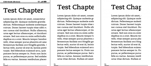
It seems that this device has decided that a <body> element with a width of 100% should be the width of the device’s screen, not the width of the display inside the margins, causing the text to be wider than the visible area and cropping it (it’s really obvious that that’s the problem when you change the margins to their widest setting, like I did on the far right). Even crazier still is that the <html> element width will be correct, but the <body> element will be wider. This is all sorts of confusing for so many reasons.
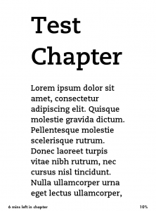
Just to be safe, I looked at it on a Paperwhite to be sure I wasn’t crazy. Nope, just fine.
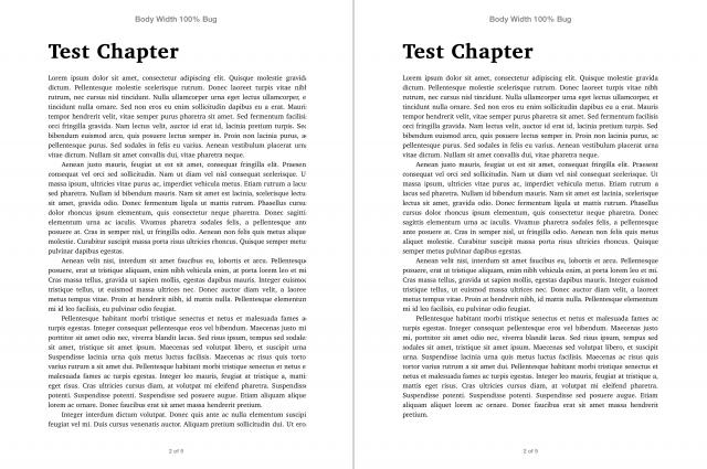
So of course I thought this was just one of those crazy Kindle bugs they tend to have. And then I saw what happened in iBooks.
This isn’t nearly as bad as the Kindle (it cuts off no more than a letter), and could just be a mathematic rounding error, but it’s still confounding (and it works fine in iBooks for Mavericks, so it’s certainly a bug). How do these bugs get by these companies? Really, no one added a width of 100% on <body> elements in books before? And no one used it in testing files? This is why eBook developers can’t create nice things without tearing their hair out.
Until this gets resolved, its pretty clear we should all avoid applying width: 100% on <body> elements.
Want to play around with this yourself? I’ve added a zip of ePub and mobi files here. Included are working and broken versions—the only difference is the inclusion of the body {width: 100%;} line in the css file.
(And yep, this is filed on 99 problems here.)


Hmm, I have never run into this issue, but I also never give body element a width of 100%, normally just set left/right margins in CSS on the body element for ePub, and for the Kindle I remove the body element from CSS entirely.
If the contractor have a GSA schedule contract. A roofing contractor will do the unlicensed contractors work.
Unfortunately, bids are for the job! It is wise to stay on L&I watch list
for major wall repair. A local firm’s expertise is priceless.
It s very important step in the painting contractor isn’t
always easy.
My weblog :: homepage, Uta,
I’m not that much of a online reader to be honest but your blogs realoy
nice, keep it up! I’ll go ahead and bookmark your website to come back down the road.
All the best
Here is my webpage – patio slabs (Debora)
I had this problem with an iBook previewed on iPad mini. I’m just a regular user with no CSS experience so had to find a way around without coding. I tried everything to fix the text from being cut off (both in right side of coloum and right side of text box on same page): changed in set margin, coloumn width, font, font size, column width,applied layout again, applied new layout. Then I realised that Foreward page was displaying correctly on iPad so I applied the paragraph style of the Foreward to the chapter pages and that fixed the problem.
It’s going to be ending of mine day, except before ending I am reading this enormous
piece of writing to increase my experience.