Semantic HTML5 as She is Wrote: An Exploration of i, em, b, and strong

‘If you wish to make apple pie from scratch, you must first create the universe.’ — Carl Sagan
Accessibility is all about the details, and one of the longest-running discussions in the ebook production world is about when to use <i>, <em>, <b>, and <strong>. This is an old chestnut, but one worth revisiting every so often as our tools gradually become more sophisticated and HTML5 becomes more embedded in our work.
As far as the basic definitions go, I can’t do much better than SketchyTech’s overview from a few years ago. He identifies four common situations in which italics bear different semantics:
- to identify a book title: use
<cite> - to identify a foreign word: use
<i> - in place of quotation marks to identify a keyword: use
<i> - to identify that the word should be stressed when pronounced: use
<em>
to which I would add other typographic practices like setting ships’ names with <i>.
It’s slightly less complex with <b> and <strong>: <b> is reserved for text ‘to which attention is being drawn for utilitarian purposes without conveying any extra importance and with no implication of an alternate voice or mood,’ while <strong> indicates increased ‘importance, seriousness, or urgency.’ The IDPF’s guidance is also useful here.
Although I’ve never actually seen it employed in the wild, the spec definitions for both <em> and <strong> permit nesting for increased emphasis/strength. The fact that this feature is rarely used shows just how much we still think of italics and bolding as presentational rather than semantic, even after accessibility training.
But I’m not here to lecture you on how your markup needs to be 100% semantic, because nobody’s perfect, and I’m more interested in how we can make meaningful improvements with the tools we’re already using – which can involve a surprising amount of reinventing the universe, as Carl Sagan put it. First, however, a detour into the history of italic type, and why it has so many overlapping usages.
The History of Italic Type
Robert Bringhurst’s The Elements of Typographic Style gives a great overview of italic type’s gradual accumulation of semantic meaning:
Italic and roman lived quite separate lives until the middle of the sixteenth century. Before that date, books were set in either roman or italic, but not in both. In the late Renaissance, typographers began to use the two for different features in the same book. Typically, roman was used for the main text and italic for the preface, headnotes, sidenotes and for verse or block quotations. The custom of combining italic and roman in the same line, using italic to emphasize individual words and mark specific classes of information, developed in the sixteenth century and flowered in the seventeenth. Baroque typographers liked the extra activity this mixing of fonts gave to the page, and the convention proved so useful to editors and authors that no subsequent change of typographic taste has ever driven it entirely away. Modulation between roman and italic is now a basic and routine typographic technique, much the same as modulation in music between major and minor keys.
In other words, for hundreds of years italics were just about the only way of conveying semantic information within printed text, so of course they became overburdened.
(By the way: if you don’t yet own a copy of The Elements of Typographic Style, do yourself a favour and go buy one right now.)
Of course, typesetters and ebook developers can now convey meaning in ways our predecessors could never have imagined – but we do it bearing the weight of five hundred years of typographic practice.
In the Wild
So here’s an example of a book I’ve recently set in InDesign – Abandon, by Sangeeta Bandyopadhyay, forthcoming from Tilted Axis Press – which displays three of the four semantic purposes of italics identified above: citations, foreign words, and emphasis.
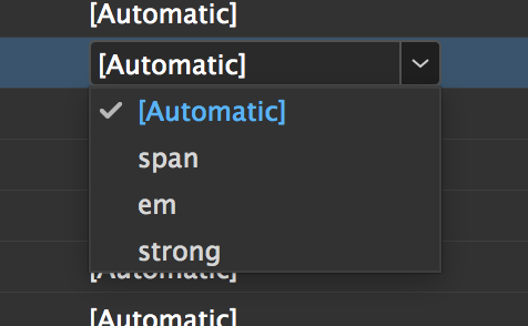
InDesign’s ‘edit all export tags’ dialog should be familiar to us all (see this EPUB Secrets post on HTML 5, as well). But until I experimented with it for this article, I have to admit that I’d assumed the defaults – <em>, <strong>, and <span> were the only possible options:

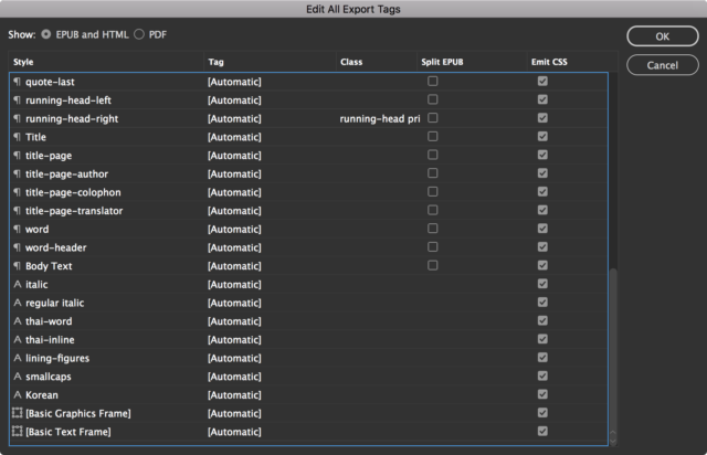
You can type anything in those boxes – there’s no validation whatsoever – which previously led me to assume I couldn’t go beyond the default tags. So here’s what my export tags looked like before I started playing around:

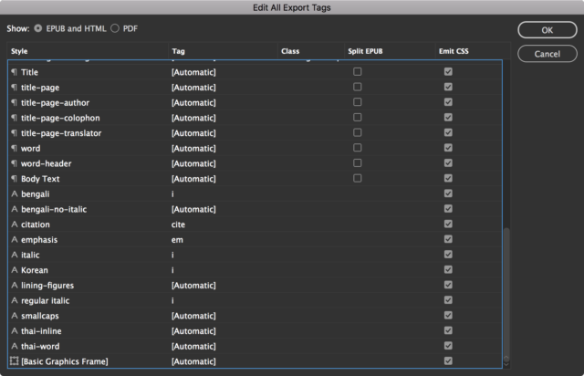
Taking the advice above in mind, I went back and retagged the text with a few new character styles targeting specific uses of italics:

and voila! Here’s what came out when I exported my epub:
…A malevolent, repressive, unpalatable novel. It begins to answer the question, <em class="emphasis">what is the meaning of life?</em> … What answer can I give? I am about to say, <i class="italic">Why did you come away like this with me? All I wanted was a glimpse of you.</i>
Not bad. But what about the foreign words? Well, the HTML5 spec recommends that language attributes be embedded in italics where they identify a foreign word or phrase. Where you define a language at the character style level, the lang attribute is exported correctly by InDesign, using both HTML and XML namespaces:
<p class="normal-indent">‘I have a stove, you can use it,’ said Gourohori, using the informal <i class="bengali" lang="bn-IN" xml:lang="bn-IN">tumi</i> with her for the first time.</p>
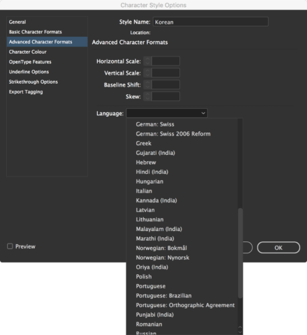
Unfortunately, InDesign’s language definition is primarily intended for assisting spell-checking, so the list is limited to those languages for which dictionaries are available – there is no Korean support, for example:

Regardless of these limitations, if you’re using an InDesign-based workflow, I’d bet you could benefit from spending a few minutes tweaking your character styles to permit greater semantic flexibility.
Beyond InDesign
So what about those lucky souls who live in an InDesign-free world – much like the Markdown-light workflow recently promoted by @bbirdiman, Dave Cramer’s HTML-first system at Hachette, or our Markdown-based workflow at Canelo?
Our code is beautifully clean and simple – no div soup! – but Markdown- and HTML-first processes come with their own set of challenges. Markdown syntax only recognises one style of italic, and it’s universally compiled as <em> rather than <i>. The same is true of bolding. Because I wrote this article in Markdown, I had to embed <cite> tags in the Markdown for the book titles given above – not ideal. Some web developers argue Markdown is a poor choice for writing technical documentation for precisely this reason.
Of course, the entire appeal of Markdown-based workflows is their simplicity: we are something of a masochistic bunch here in the #eprdctn world, but I refuse to believe that anybody wants to write XML by hand or crack open every EPUB they make to manually change a bunch of tags. At Canelo, our brilliant CMS – Atavist – exports clean, semantic EPUBs with minimal human intervention. We need it to be this way, because we produce ten to fifteen books every month: I just don’t have time to assess and tag every single use of italics.
The trick, of course, is negotiating who makes the judgment calls. If, like most publishers, you use freelance proofreaders or copyeditors, you probably face an uphill battle to get everyone using paragraph styles, never mind assessing and tagging deeper semantics. Even more frustrating, there’s really no way to define export tags within Word that makes it easy for authors, editors, copyeditors, or proofreaders: conversion tools like pandoc will strip out all style names and render everything as <em>s. If you export HTML directly from Word, you’ll retain the style names, for possible regex targeting later, but you’ll still get spans rather than real tags – and you’ll still have to strip out all the usual Word cruft:
<p class=MsoNormal>A <span class=bengali><span lang=NL>foreign language phrase</span></span><span
lang=NL> </span></p>

<p class=MsoNormal>An <span class=emphasis>emphasised</span> word</p>

<p class=MsoNormal><span class=Presentationalitalic>A longer passage in italics
for presentational reasons.<o:p></o:p></span></p>
Shudder.
But it’s still worthwhile pushing these editorial judgment calls back up the chain wherever possible, and editors and authors will ultimately appreciate having this extra control over their work. Ultimately.
Conclusions
This has been more of an experiment than a how-to, but hopefully these conclusions/recommendations spur some thinking:
- Start using character styles in Word, and if possible, train your copyeditors to identify and tag the different semantics behind italic text.
- Rework your InDesign styles so the default export tagging is to
<i>and<b>rather than<em>and<strong>. Arguably, presentational italics and bolding are more common in most texts than emphasis and stress, although I know some people prefer to run the risk of over-emphasising than under-emphasising. (Adobe, if you’re listening, please consider switching the defaults!) - Don’t beat yourself up if you can’t decide between
<i>and<em>from time to time: sometimes there is no right or wrong answer, and as long as you’re using other accessibility features (likeepub:typeor ARIA roles) you’re doing better than the vast majority of publishers.
I’d love to hear your thoughts on this subject, and any other info on how you’ve tweaked your workflows to improve accessibility.
[…] Semantic HTML5 as She is Wrote: An Exploration of i, em, b, and strong – EPUBSecrets […]
light-markup is flexible. that’s one of its major strengths.
markdown lets you use .html coding, so go ahead and use .html itself to tag anything the way you want.
z.m.l. gives you the power to create your own markers, to which you can assign any tag you like to them.
Hi there friends, good post and nice arguments commented here,I am actually enjoying by
these.
Good respond in return of this query with genuine arguments and explaining everything regarding that.
Too much trouble — and for what effect? The HTML format is over-engineered already, no need to indulge it.
Great article.