Getting to Know You

This guest post is from Jiminy Panoz, who spends his days wrestling CSS and vendors and doing all the eprdctn dirty work.
One major part of the Readium CSS project is collecting feedback and queries from the #eprdctn community. This is really important to us, as openness and transparency are values we’ve been willing to defend from the start.
Consequently, I thought it would be cool making a recap to share what we’ve learned, how it helped us make informed decisions and where #eprdctn may be heading.
Thanks again to the people who offered feedback (and samples)!
The typical #eprdctn profile
I know there is no average, there are extremes (and the middle will take care of itself) but, from experience, a pretty common profile is emerging. Maybe you’ll even identify with the following description. Who knows?
The typical e-productioner has been doing e-production for 3 years or more (76%), is primarily concerned about interoperability (80%) and feels like she/he gets at least CSS fundamentals (88%).
Now, we can tell specific versions for iBooks and other modern apps offering solid HTML and CSS support still exist. And sometimes, people (and software) might produce an EPUB 2 file to get around support uncertainty, which isn’t a surprise.
One key here is progressive enhancement techniques, which reading systems should probably focus on, maybe even creating incentives so that those techniques become the norm. That is the approach we are working toward with the Readium CSS.
Workflows
It shouldn’t surprise anyone that workflows are still print-centric, which makes DTP software prevalent (more than 2/3 of answers). But it’s also worth noting automation is a thing, and some e-productioners are using XML and node.js (dude, you’re brutal!).
We’ve been willing to explore and provide new design options (full bleed, positioning contents in the margins, etc.), and it seems that you’re appreciating that. Indeed, more than 75% of respondents are open to such design options, even if that would imply extra work.
We’re aware change would not happen overnight though, since you would have to adjust your workflows and upgrade your automations.
Authoring practices
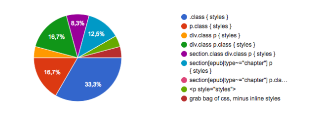
CSS authoring varies greatly. What’s interesting is that almost 2/3 of e-productioners use a custom stylesheet, they don’t just rely on the styles output by their DTP tools. Another consequence is that there’s no consensus when it comes to the CSS selectors you use.
Those are all the various approaches we must take into account for user settings.
Main factors impacting your authoring practices include:
- ease of use;
- complexity and variety of the publication contents;
- semantics (especially with
epub:typein EPUB 3).
There’s quite an interesting insight for Reading System developers there: CSS authoring is liberal by nature. We must find clever and inventive ways to solve the user settings issue properly; we can’t rely on selectors and their specificity in practice.
And believe it or not, the future is bright!
There’s been a lot of efforts related to user settings lately. For instance, Apple has made a formal proposal for User Agent properties: they would allow authors to design user-centric stylesheets.
In theory, if you used those properties and put some flags in your file, Reading Systems wouldn’t have to override your styles. At all. Indeed, you would take care of user settings yourself.
And there’s also a proposal for personalization semantics, which would once again impact user settings.
Readium CSS has been designed to take those proposals into account. We’ve made sure to future-proof it so that we can implement those specifications once/if they become recommended.
Worries and issues
Now we’re getting down to business!
What bothers you the most:
- the app overriding styles without asking/the user’s explicit demand (a.k.a. changing a user setting);
- the complete lack of control over page layout (margins, background, etc.);
- user overrides which are all or nothing.
And your issues, in order of priority:
- images’ sizing e.g. author’s sizing is not respected, image is cut-off;
- broken media queries (which makes responsive design impossible);
- lack of support for modern CSS;
- Math.
The good news is that we’ve dedicated a lot of energy to solving most of those issues without side-effects.
Sure, we can’t do miracles but we won’t override your styles unless strictly necessary (user setting, pagination, etc.), we’re willing to find compromises for user overrides, have minimal safeguards for your images so that they don’t get cut-off, and try to implement the EPUB specs down to the letter.
For more complex issues, we’re willing to collaborate with the CSS-multicol spec editors since we’re probably one of the major use cases for this specification. That will be a long and slow process but it will be worth it.
Popular requests
Unsurprisingly, a lot of requests are about layouts possible in print that you can’t do in digital.
- Full bleed (container, image, background)
- Support for paged-media (running header/footer, floating figures at the top/bottom, etc.), which is probably a request by @dauwhe
- Vertical centering and alignment
- Floated shapes (wrapping the image and not its bounding box)
- Possibility to use margins for icons and page numbers
- Baseline grids
- Forcing chapter title as running header
- Proper support of page-breaks
- Media queries for reading modes (sepia, night, etc.)
- Styleable popup footnotes
Interoperability
We care deeply about interoperability. Although Readium CSS has been designed from scratch, a lot of research has been put into other Reading Systems in order to improve interoperability.
Let’s say that one of our major goal is to provide you with a solid bedrock, so that Readium CSS does not become an issue.
A few interoperability issues have been reported, and I guess it’s worth listing them:
- page margins: some apps/devices have huge page margins, others don’t have any; it’s really hard to know what authors should be doing here;
- support what already exists, don’t create custom metadata, styling, etc.;
- font obfuscation isn’t implemented everywhere, which can be a problem, especially for fixed-layout.
Obviously, Readium CSS can’t change the entire ecosystem, but at least we’ve tried to start a trend, and that’s something we learnt from the web.
A lot of resources are spent improving interoperability in web browsers nowadays, and we feel it should be the same for Reading Systems.
Now, Readium CSS is just part of a bigger project, Readium 2. And the whole project has made decisions based on interoperability (for non-linear contents, external links, dynamic page numbering, footnotes, etc.). How cool is that?
Conclusion
Your feedback and samples have been invaluable, I hope this post can prove it.
We reached our first milestone a week ago: a functional prototype. Once again, please feel free to weigh in. We’ll take your remarks into account and try to improve Readium CSS to fit your needs.
It’s all the more important that EPUB 3.1 is now aligned with the web on HTML and CSS, and we’ll need to support the W3C snapshots. So if you think some proposals are interesting, and would like us to research and explore them a little bit, just let us know!