Avoiding Bad Punctuation Breaks in eBooks
[This tip is written by guest contributor Derrick Schultz. More about Derrick at the end. —AMC]
Common typographic details that are easily solved in InDesign can be a big hassle in eBook production. One such detail is the handling of breaks between words and em dashes or ellipsis. InDesign (correctly) assumes these punctuation marks need to stay with the word previous to it, but ereaders will not always keep the word and punctuation together.
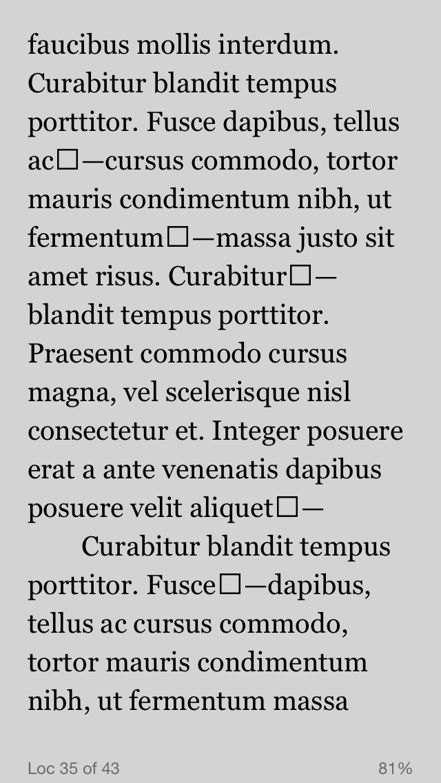
In most cases you will be lucky and won’t have bad breaks happen right between a word and an em dash, but if you work with a writer who uses them a lot or on narrow reading devices (like phones) you’ll probably see this:
And it will probably drive your editor crazy. Here’s how to fix it.
The Zero Width Non-Breaking Space
The trick is to use a zero width non-breaking space (ZWNBSP). You’re probably familiar with the non-breaking space, used in your xhtml file as either or  . The Zero Width does the exact same thing as the regular non-breaking space except that, well, it displays visually as if nothing is there.
How NOT To Do a ZWNBSP for eBooks
Unlike or  , there isn’t a true zero-width charter in the unicode set. The Wikipedia page for it says it has been deprecated and recommends that you use a word joiner instead (⁠). The problem: the word joiner character’s support is pretty terrible on most ereaders, and renders as an empty box—which is worse than a bad break would be.
Another common solution for web developers is the use of the white-space: nowrap; in a <span> tag (see this discussion on StackOverflow for more). But like the other Word Joiner unicode character, I found support for this to be spotty in a lot of e-readers. You could use it when available and just learn to live with the bad breaks on non-supporting devices. But there’s one more solution possible…
The  character
So after some frustrating attempts to find a ZWNBSP that worked, I returned to the supposedly deprecated character. While &zwnbsp; doesn’t even exist, surprisingly  does work in every reader except mobi7 kindle readers.
A workaround for Mobi7 eReaders
As mentioned above, the  character is not supported in mobi7 files. It displays as that terrible looking box shown above. Since its purely a mobi7 issue, however, we can work around this problem by wrapping the tag in a span and removing it with a mobi7 media query
Here’s your html:
<p>Maecenas faucibus mollis interdum. Maecenas sed diam eget risus varius blandit sit amet non magna<span class= "kf8only-inline"></span>—</p>
And here’s what to add your CSS file:
@media amzn-mobi {
  .kf8only-inline {
    display: none;
  }
}

@media amzn-kf8 {
  .kf8only-inline {
    display: inline;
  }
}

There you have it. A zero-width non-breaking space that works great on most e-readers, and degrades gracefully on e-readers that don’t.
********************************
Derrick Schultz is a book designer and developer living in Brooklyn, NY. He currently heads up digital design and production workflow projects at Atavist Books, and contributes his ebook knowledge to Creatavist. You can find him on Twitter as @dvsch.
This is rather confusing article, and most importantly: if U+FEFF does not work for mobi7 readers, then the obvious solution should be the CSS way with white-space: nowrap (rather than a tricky non-conforming CSS rule). Which e-book readers fail to obey this property (which has been in CSS since the very beginning), what exactly happens, and how the failures can be reproduced?
Jukka,
There’s a couple problems with white-space: nowrap;
1. Lack of support: I’ll need to go back and check, but I recall mobi7 doesn’t really support nowrap, and ADE 2 had issues with it as well. As I recall, it just ignores nowrap, so the solution above has a higher range of support across e-readers. If I’m incorrect in that, please let me know—I’m be happy to hear about it.
2. It requires a wrapping both the word and the em dash, which is a much more frustrating alteration to have to make programmatically then a much simpler find and replace.
I’m also not sure what you mean by this being a “non-conforming CSS.” What in the above sample doesn’t conform?
I would rather expect the article to provide for confirmed observation about what actually happens, if it claims that a basic CSS feature is not supported and suggests a more complicated approach.
Media names amzn-mobi and amzn-kf8 are nonstandard.
While those media names are non-standard, they are defacto standards for those devices, not unlike prefixed css3 styles.
I’ll take a look at the white-space support when I get a chance, but I know ePub Secrets would also gladly accept an article from you if you’d like to refute my findings 🙂
[…] name is Derrick. I wrote a guest post last week. This week I’m excited to announce I’m joining ePubSecrets as an […]
[…] [Read more at] […]
http://www.beatlebilia.co.uk/price/moncler-chevalier.html moncler chevalier
I am very glad that I stumbled throughout your website in my quest for info referring to this.
Oh my, what a great article. Thank you!
This technique does add a thin but still obvious and sort-of out of place extra separation between the em dash and the letter next to it in eink Kindles (tried on Kindle 4 and Voyage).